house

Styling A "Dinner Party Ready" Table

Featuring gifted items from MADE

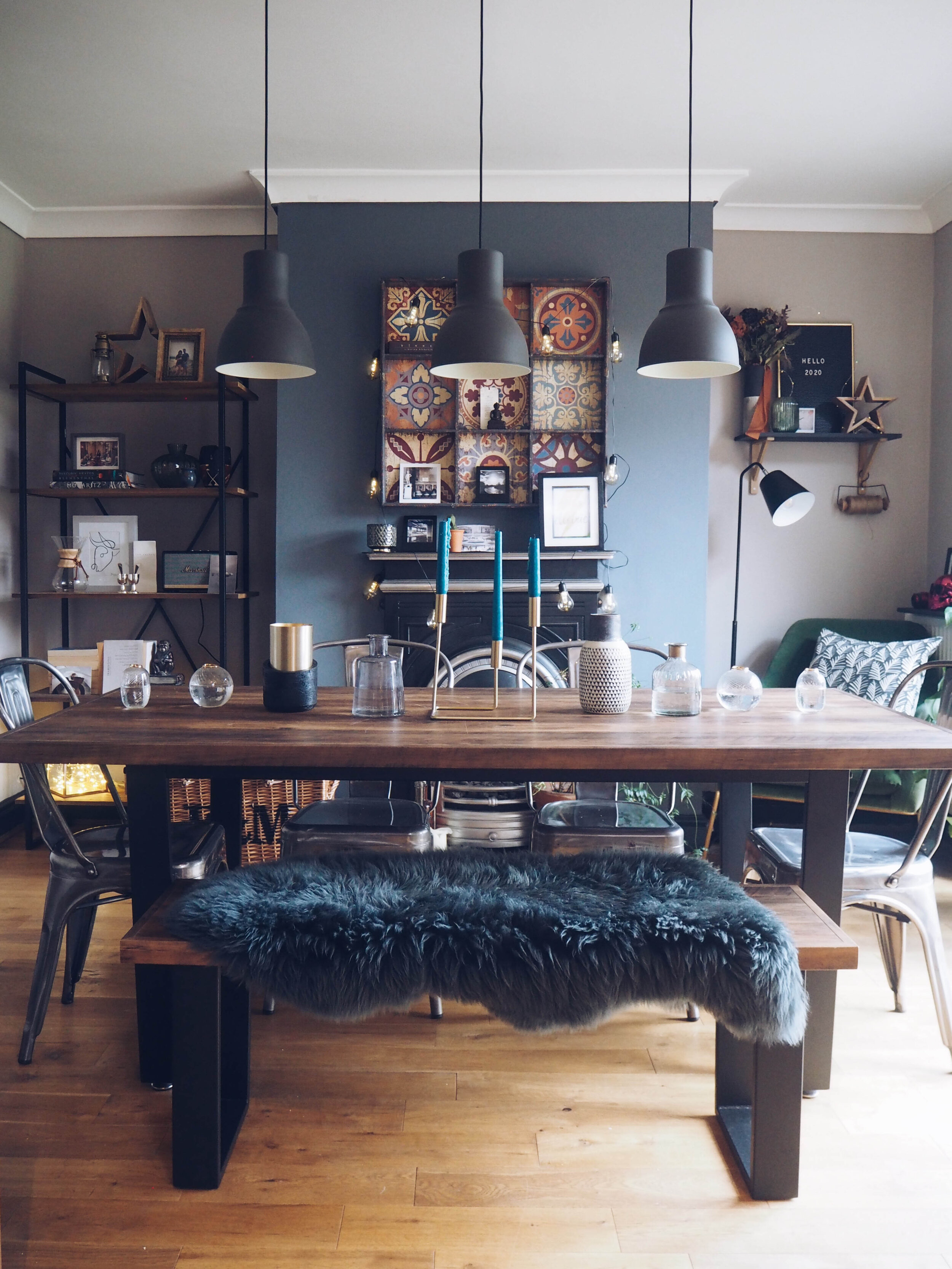
One of my favourite things to do is throw dinner parties for friends and whilst I’m staying as far away from the kitchen as possible, I am making sure the dining table has the wow factor! By breaking the styling into stages it isn’t as daunting as it may seem. I used gifted products from Made and gifted flowers from The Flower Lounge but this can just as easily be achieved with existing tableware you already have.

How To Style a “Dinner Party Ready” Table

How To Style a “Dinner Party Ready” Table

Step 1

Start with a blank canvas. It may sound obvious but you’d be surprised how many people don’t strip the table first, trying to rearrange things already on there. By stripping it back completely, you are able to assess what items you do and don’t have, what bits you don’t need and what needs to go on first.

Step 1. Strip the table back to a blank canvas.

Step 1. Strip the table back to a blank canvas.

Step 2

Find your centrepiece. This could be a candlestick, a bunch of flowers or a decorative ornament. Place it directly in the centre of the table. The Verona candlestick is the perfect item for me as it dictates the height of the other objects I’m going to put on the table. I have used some left over wedding candles but my next favourite place to get tapered candles is Sostrene Green. They do all different colours for whatever scheme you may be looking to achieve.

Step 2. Centrepiece.

Step 2. Centrepiece.

Step 3

Add the secondary objects. In my case it’s going to be various vases from all over the home. The more random the better for my taste, but there is no right or wrong way to do it. Matching items could work just as well. Play with the positioning of the vases, creating a pyramid shape with the tallest items towards the centre and the smaller ones towards the ends of the table.

Step 4

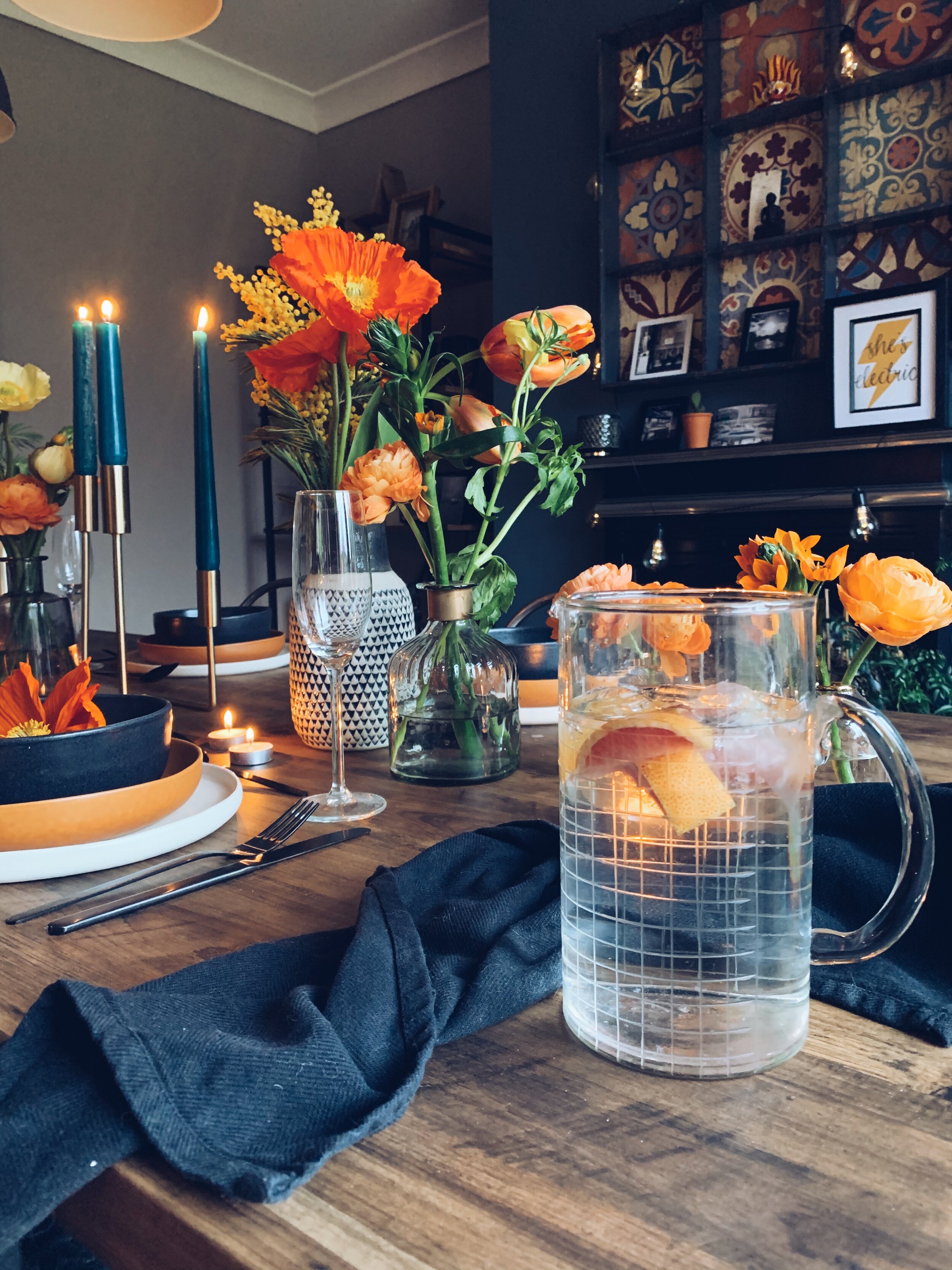
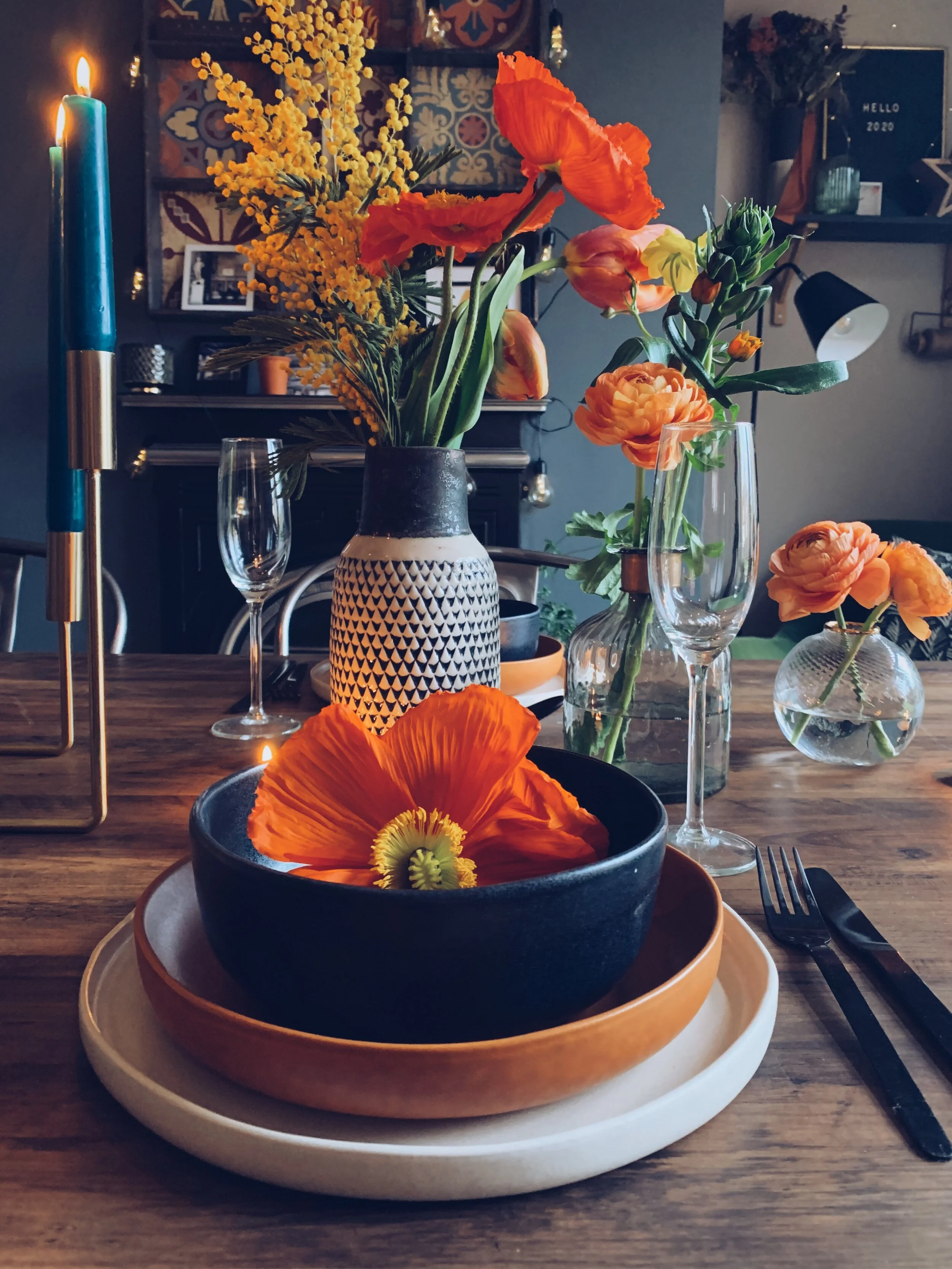
Insert Flowers. I have gone for a wild theme with lots of pops of oranges and yellows for a fresh feel. Any colour and any flower will look pretty and I love when they are spread over numerous vases - it gives a “freshly picked from the garden” feel. Shout out to Sian from The Flower Lounge in Didsbury for supplying me with the most gorgeous poppies and french tulips.

Flowers add that extra wow factor to any dining table.

Flowers add that extra wow factor to any dining table.

Step 5

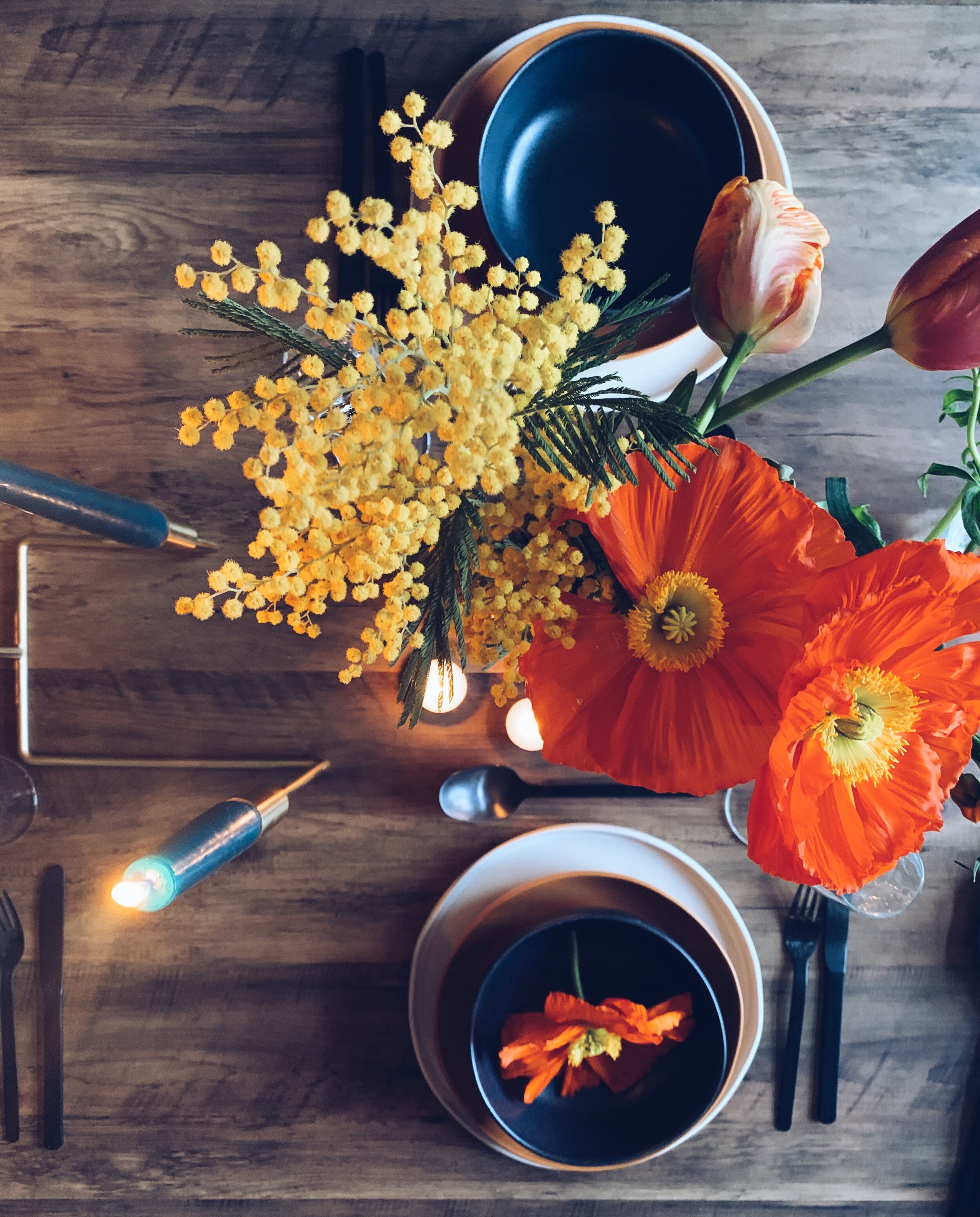
Place the tableware. Made’s gorgeous Ingram 12 piece dinner set was the inspiration for the colour scheme as you can see with the terracotta side plates. Gone are the days of matching tableware, it’s time to get adventurous. The stoneware is imperfect with different shapes making it impossible for stacking but it gives that real authentic earthy feel, which I love. Pairing with matt black Bude cutlery gives a contemporary edge.

Made x Northern Styling

Made x Northern Styling

Step 6

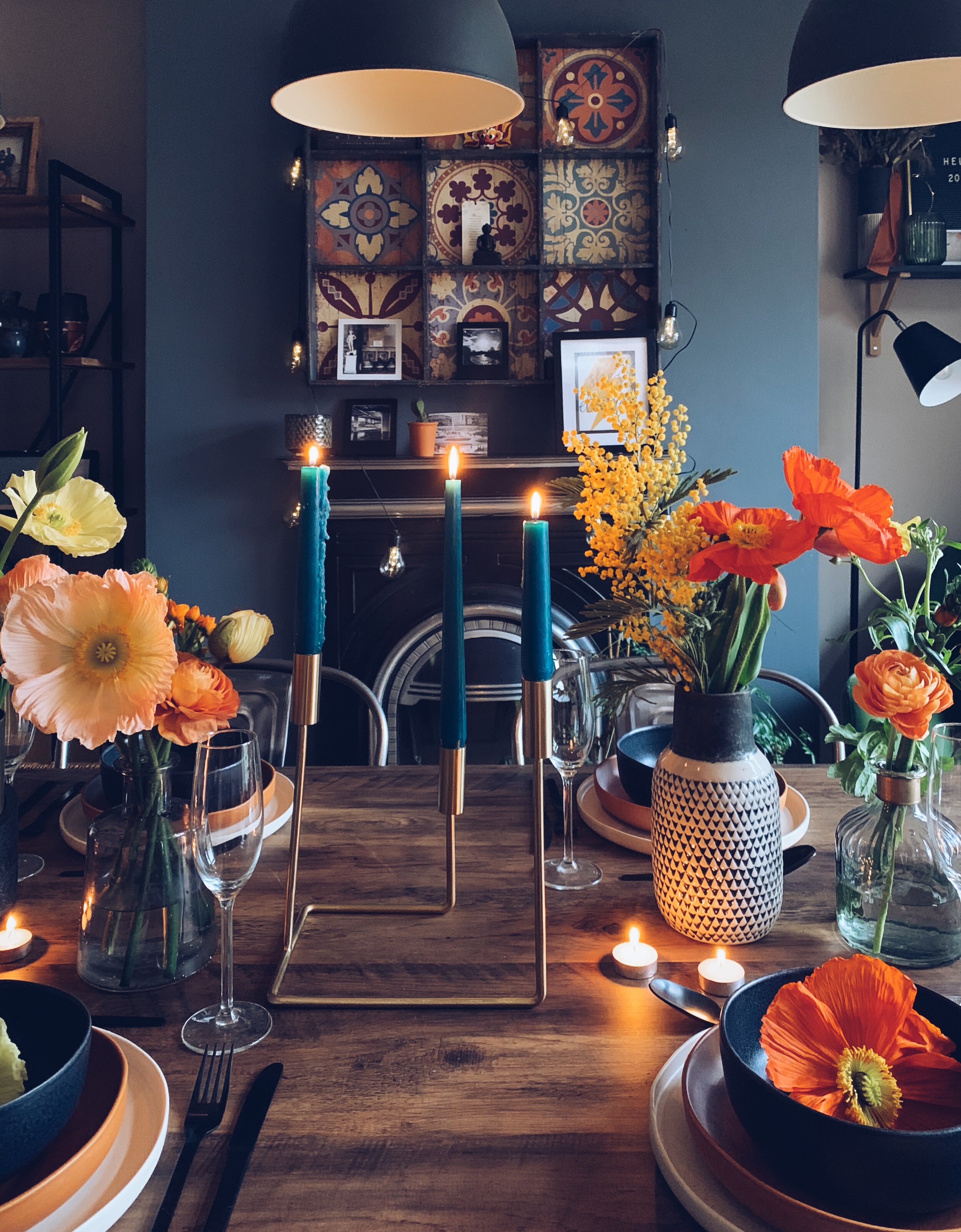
Final touches. Scatter tealights in between the vases, light all candles and if you want to add a extra wow factor - add a token favour on the plate. I used some left over poppy heads which looked lovely against the black bowls. Other ideas include styling the napkins in the bowls or gorgeous tonal fruit for a decorative touch.

Voila! Candles, flowers and gorgeous tableware help make a wow factor dining table.

Voila! Candles, flowers and gorgeous tableware help make a wow factor dining table.

Step 7

Admire your handiwork. Always take a step back in between stages to assess the table from afar. Does it look balanced? Is it symmetrical if that’s what you were going for? Don’t forget to take some snaps. Would love to be tagged to see all your creations!
Happy Styling!
file (1).gif
Pink Photo Wedding Pinterest Graphic.png

Colours Of The Year 2020 & How To Use Them

With Christmas dominating interiors at the moment, it’s hard to imagine what’s coming after that but soon the interior world will be full of new season trends for 2020. This can be overwhelming and by no means should you follow “trends” if you’re not actually that keen on them. But if you are thinking of refreshing your home in the new year, here are my top picks…

Pantone - Classic Blue

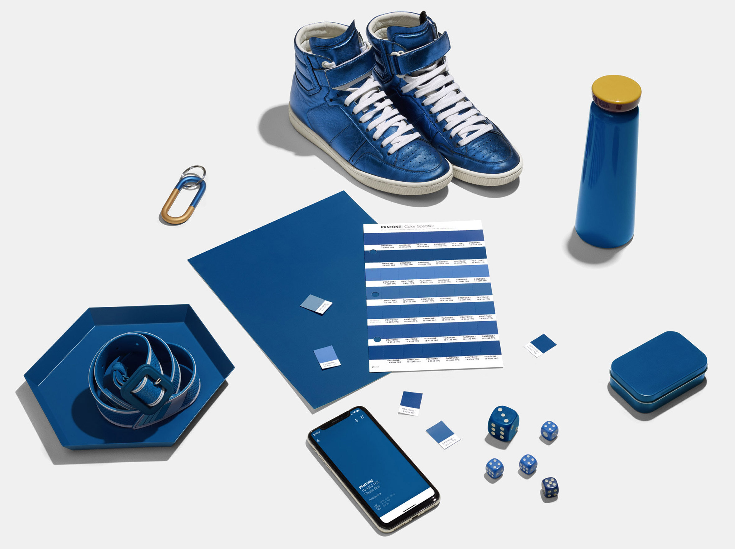
Pantone Colour of the Year 2020

Pantone Colour of the Year 2020

First up is the big one which was just announced this week - Pantone’s Classic Blue. I was so relieved when I found out as I have been telling clients it will be a blue for a while! Classic Blue, Purist Blue, New Blue has been popping up a lot in my trend research over the last few months. It is seen as a "solid and dependable" hue bringing calm into our lives. We are entering a new decade and feelings of instability feel at an all time high across all areas - politics, environment, technology. Returning to a classic colour is a definite reaction against this and I feel like it’s a running theme across many colours for 2020.

Image Via Dezeen

Image Via Dezeen

Ways To Use It

Blue kitchen cabinets are a really popular choice at the moment and exciting things are happening for my own kitchen in January so stay tuned! The blue works well for both contemporary slab doors and traditional shakers and can be paired with a variety of worktops and tiles to give a truly unique feel every time.

Virtuoso kitchen by Mowlem & Co

Virtuoso kitchen by Mowlem & Co

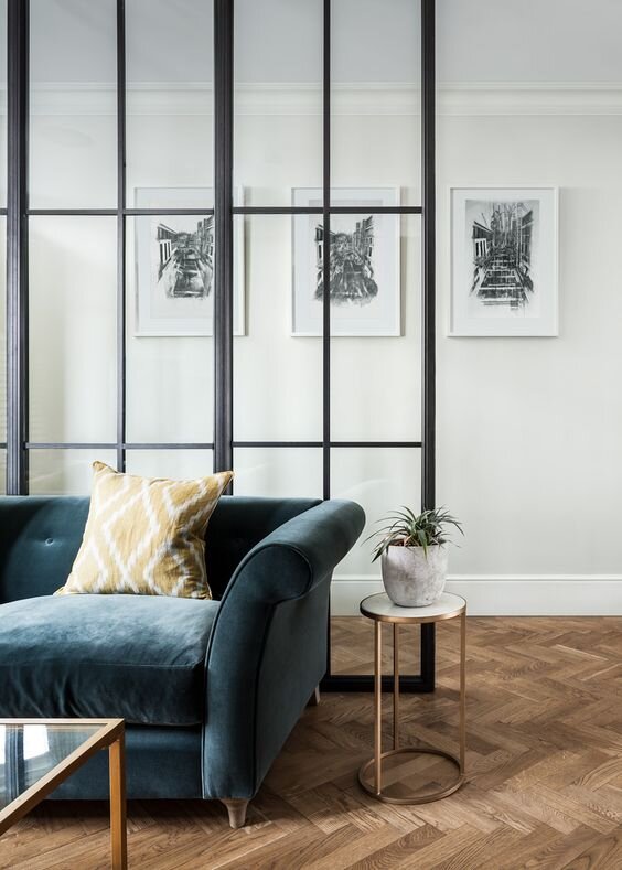
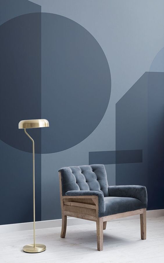
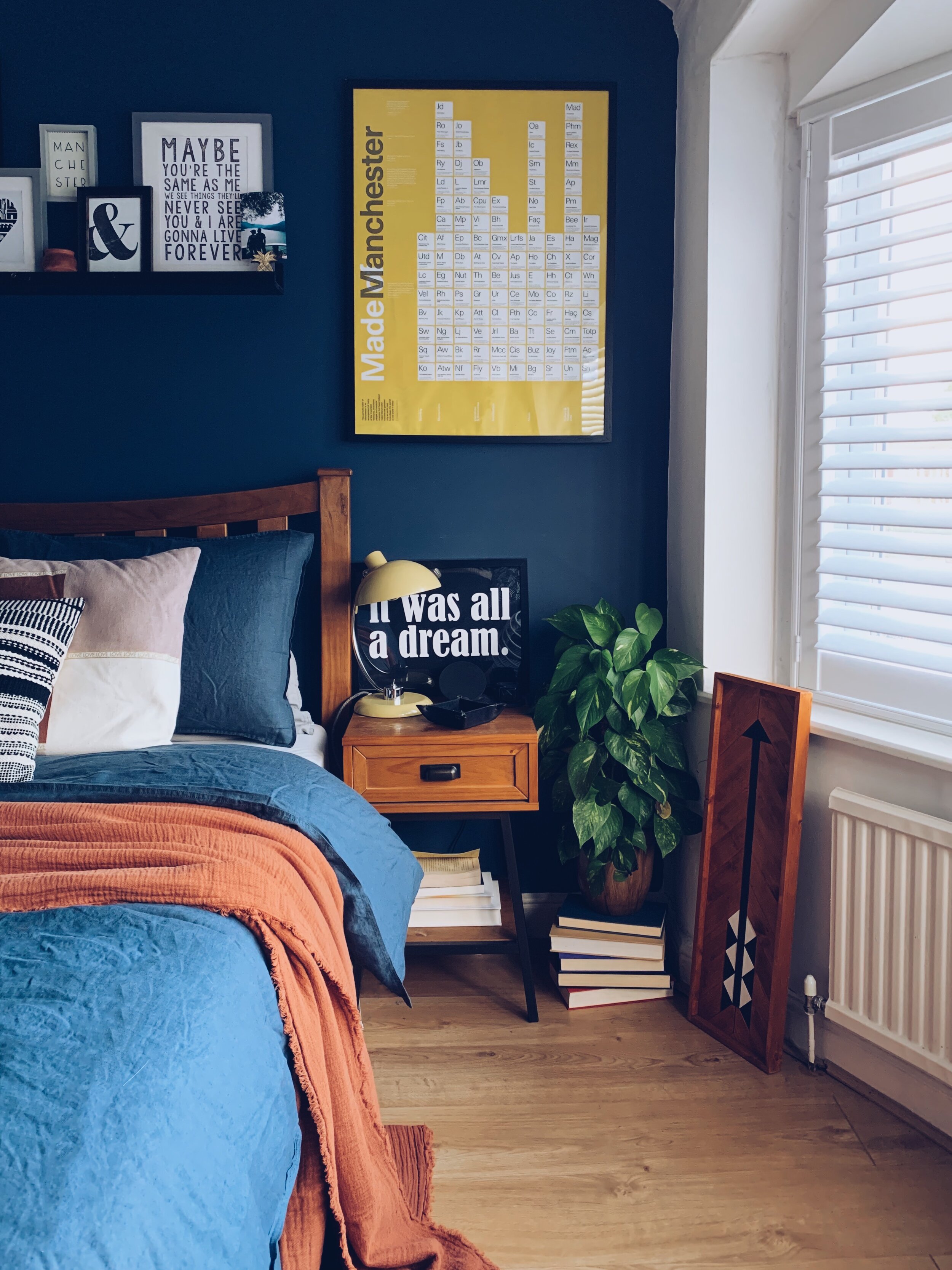
If you want to add small amounts, you could try adding it to your next sofa, or a feature wallpaper and even smaller would be bedding like I have done in my own bedroom. Textiles are a fabulous way of introducing colour in small amounts without breaking the bank.

Dulux - Tranquil Dawn

Image via Dulux

Image via Dulux

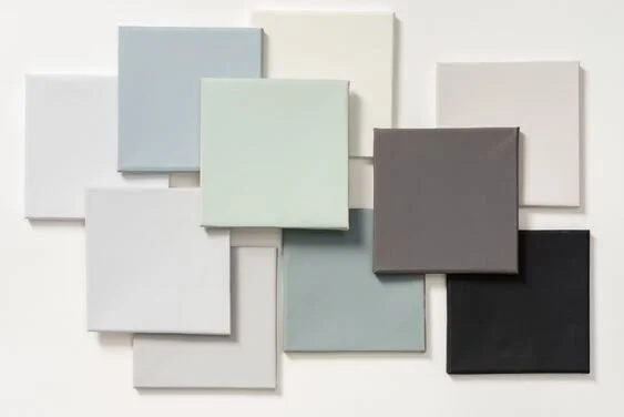
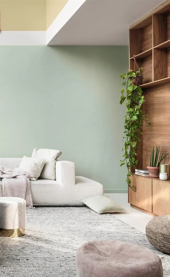
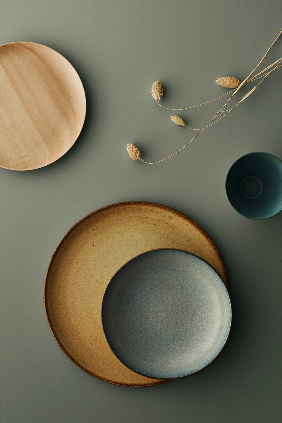
Following on the same theme of calmness, Dulux have chosen a lovely minty green as their Colour of The Year. The colour is inspired by the morning sky and reflects our desire for calm. Dulux also say it has the “Human Touch” which I feel is a reaction against the never ending technologies which are becoming more and more dominant in our lives.

Image Via Behance

Image Via Behance

Ways To Use It

Tranquil Dawn feels perfect for a Spring living room refresh which can sit really well with your already existing grey sofa and warm wood cabinetry. Paired with a soft pale pink and the space immediately becomes a lovely little haven.

Image Via Dulux

Image Via Dulux

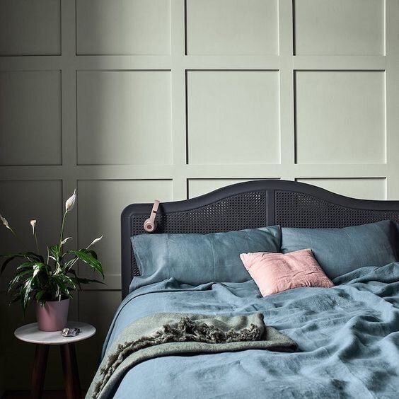
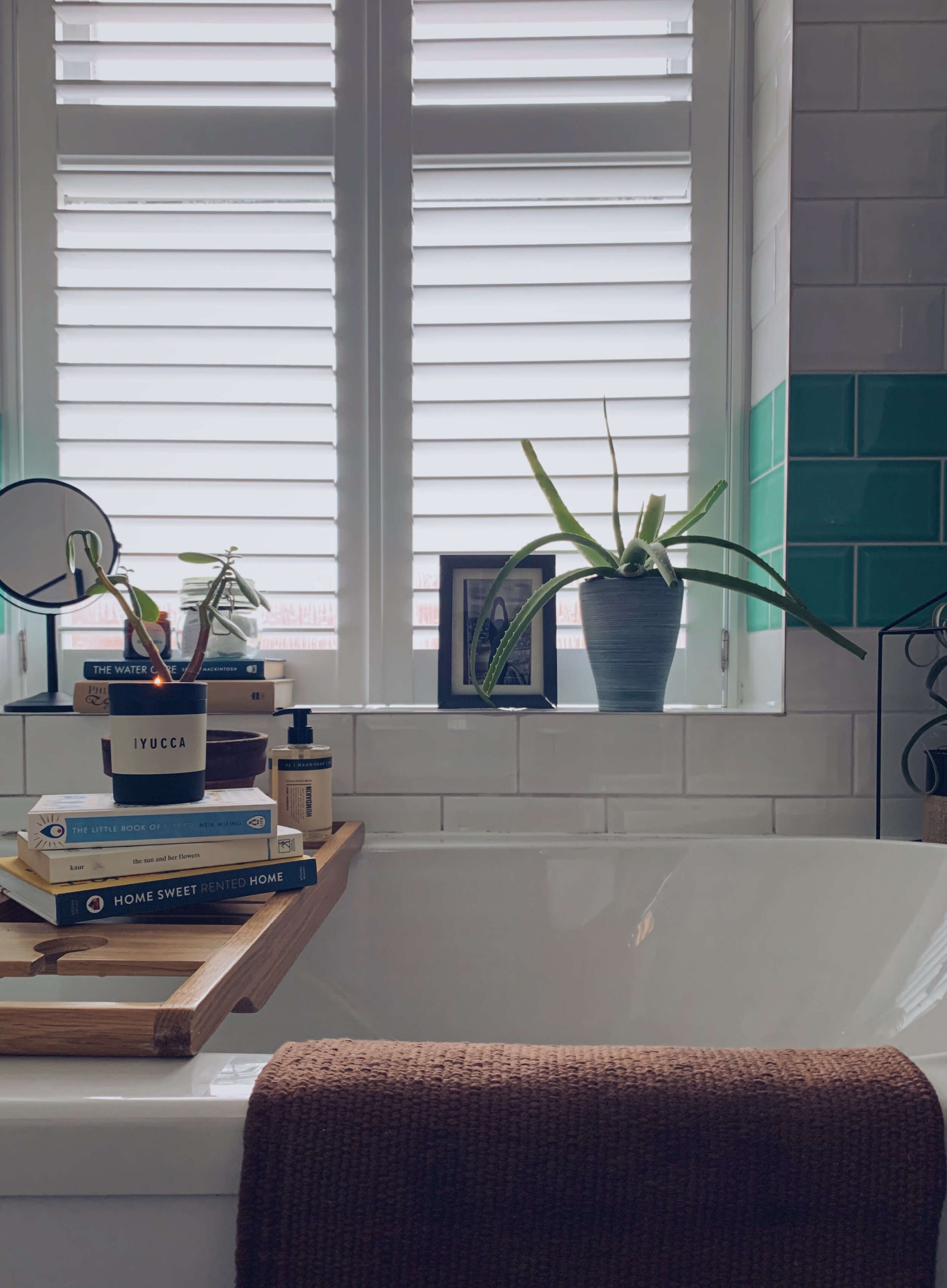
It also looks really good in a bedroom which layers of teals and greens. The bathroom is another good place as minty tiles can help even the smallest room feel fresh and new as seen in my dinky bathroom! On a smaller scale, ceramics are a good easy introduction to Tranquil Dawn and it will fit in with your existing collections.

Graham & Brown - Adeline

Screenshot_1.jpg

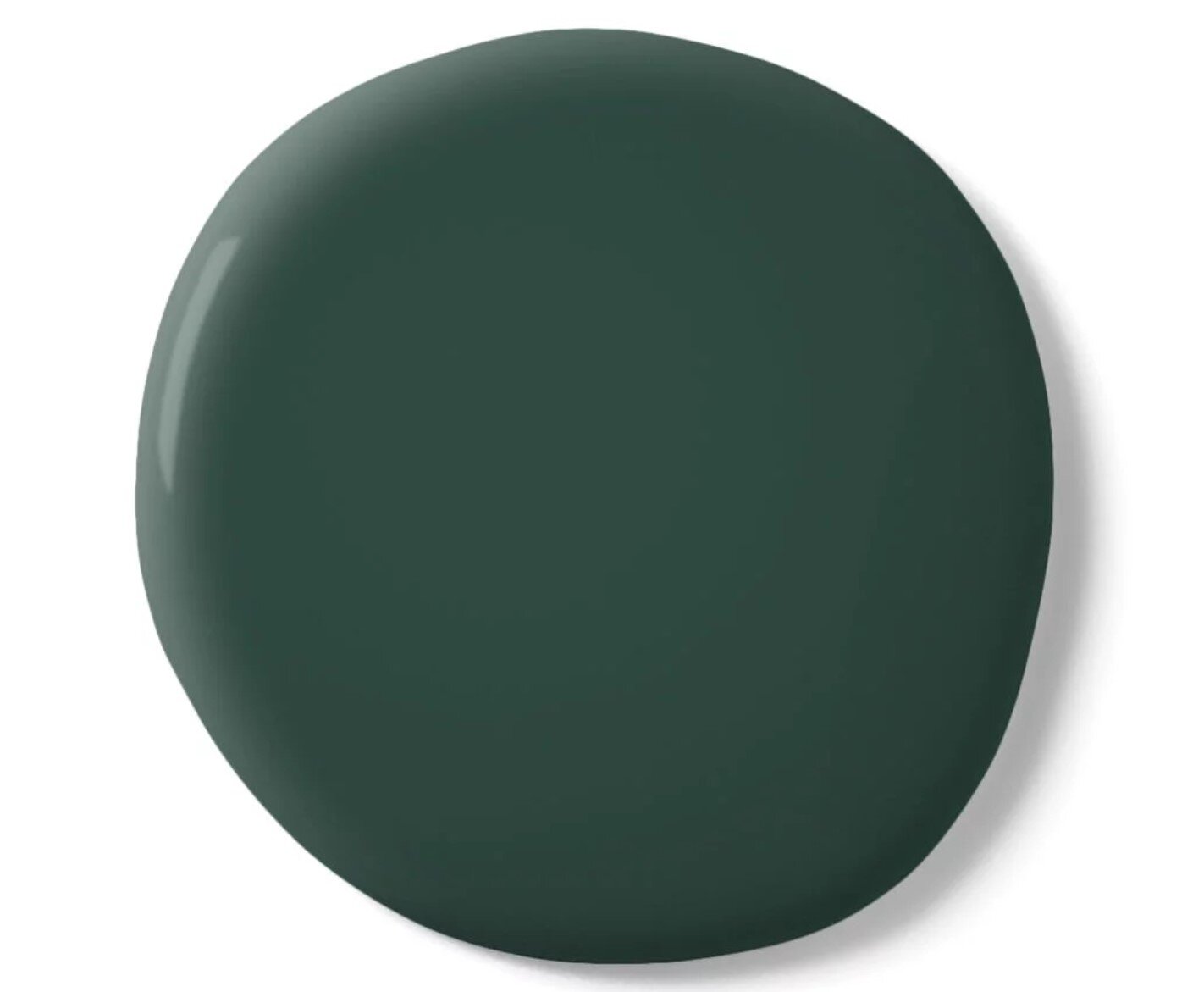
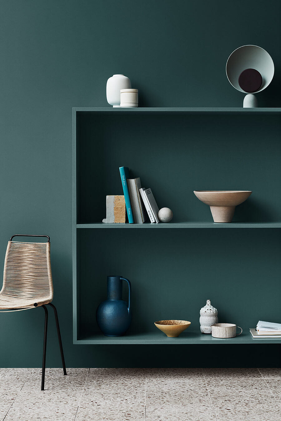
For the bolder of us, Graham & Brown’s Adeline is a deep rich bottle green hue which can be used all over or as a statement colour pop, and it works amazingly either way. Again taking inspiration from nature this feels like a regal green which evokes feelings of history and balance in these uncertain times.

Image Via Graham & Brown

Image Via Graham & Brown

Ways To Use It

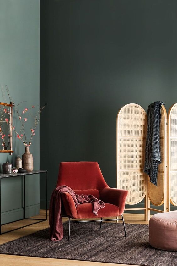
I love all over colour rooms where everything is one colour - the walls, the woodwork, the window frames. It gives a sense of unity in a room and even the brightest of colours will become the neutral when done like this. Of course this lovely forest green wouldn’t be complete with lots of plants and greenery to create an overall sanctuary.

Images via Graham & Brown

Images via Graham & Brown

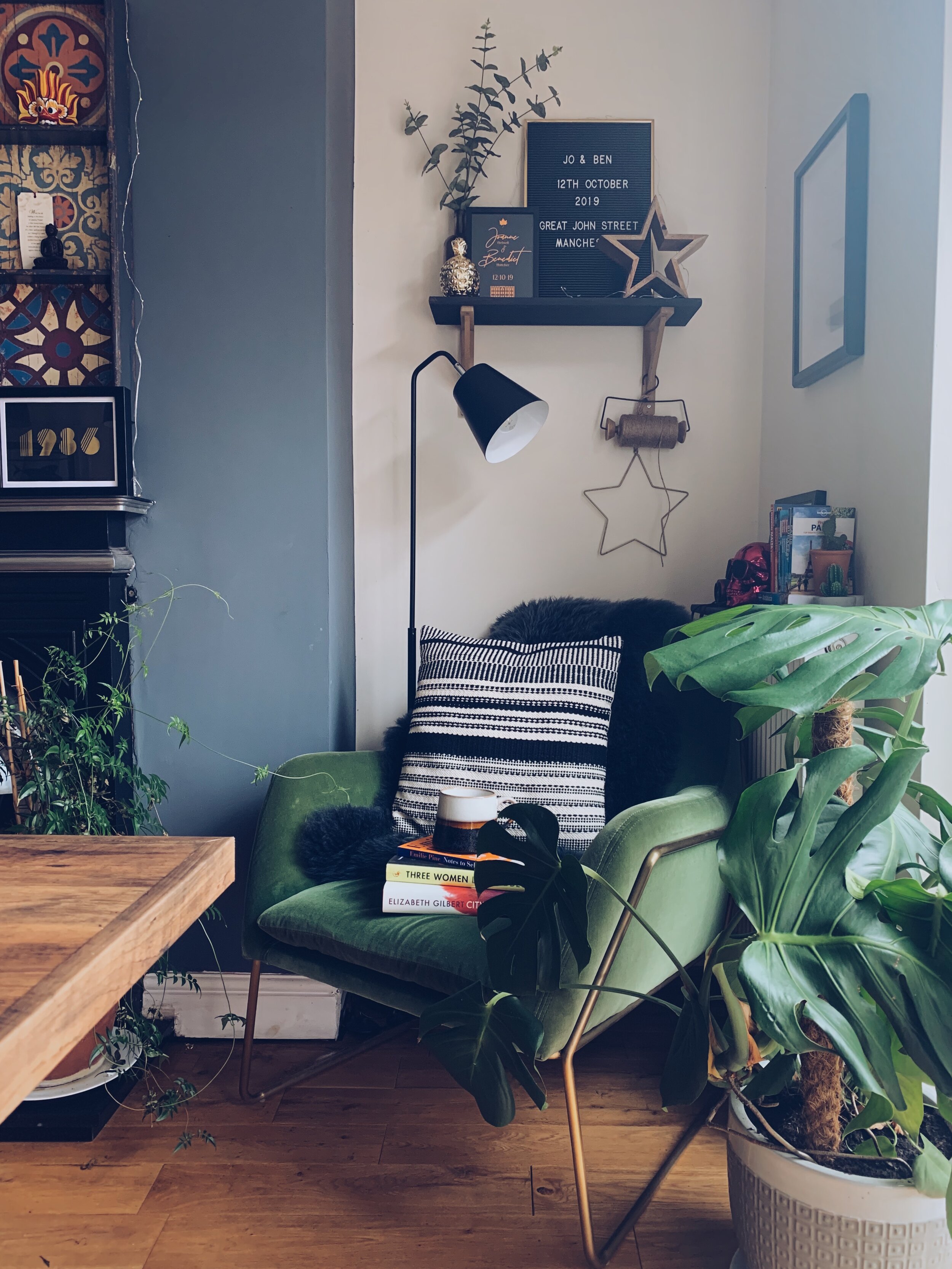
This green looks really good when mixed with blues and natural materials too. Of course I would highly recommended a lovely velvet accent chair to act as a colour pop. Mine is from made.com and although it’s a couple of years old now, it still looks fresh in our space. I have talked before how rattan and cane-weave will continue to dominate interiors for the next few year and this green is the perfect backdrop for it. Look how amazing it also looks which the bold red chair too - it’s such a versatile green.

So those are my top picks from the Colours Of The Year 2020. Which one is your favourite?

Pink Photo Wedding Pinterest Graphic.jpg

Ways To Use Tiles In Your Home

Paid Partnership With Tile Giant

I am delighted to be back working with Tile Giant creating some new mood boards for Autumn/Winter 2019 and Spring/Summer 2020. Ever dreamed of having a polished concrete in your extension or hardwood floors in the hallway but found the price way out of budget? Well concrete and wood effect tiles are the perfect alternative as they are incredibly hard wearing and can be a cost effect way to incorporate these natural materials into your home.

1. Concrete Effect

Commix Grey 600x600

Commix Grey 600x600

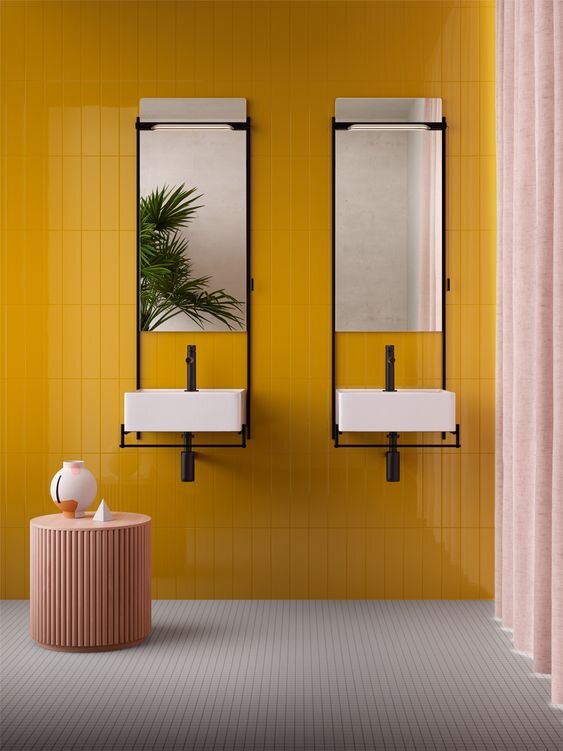
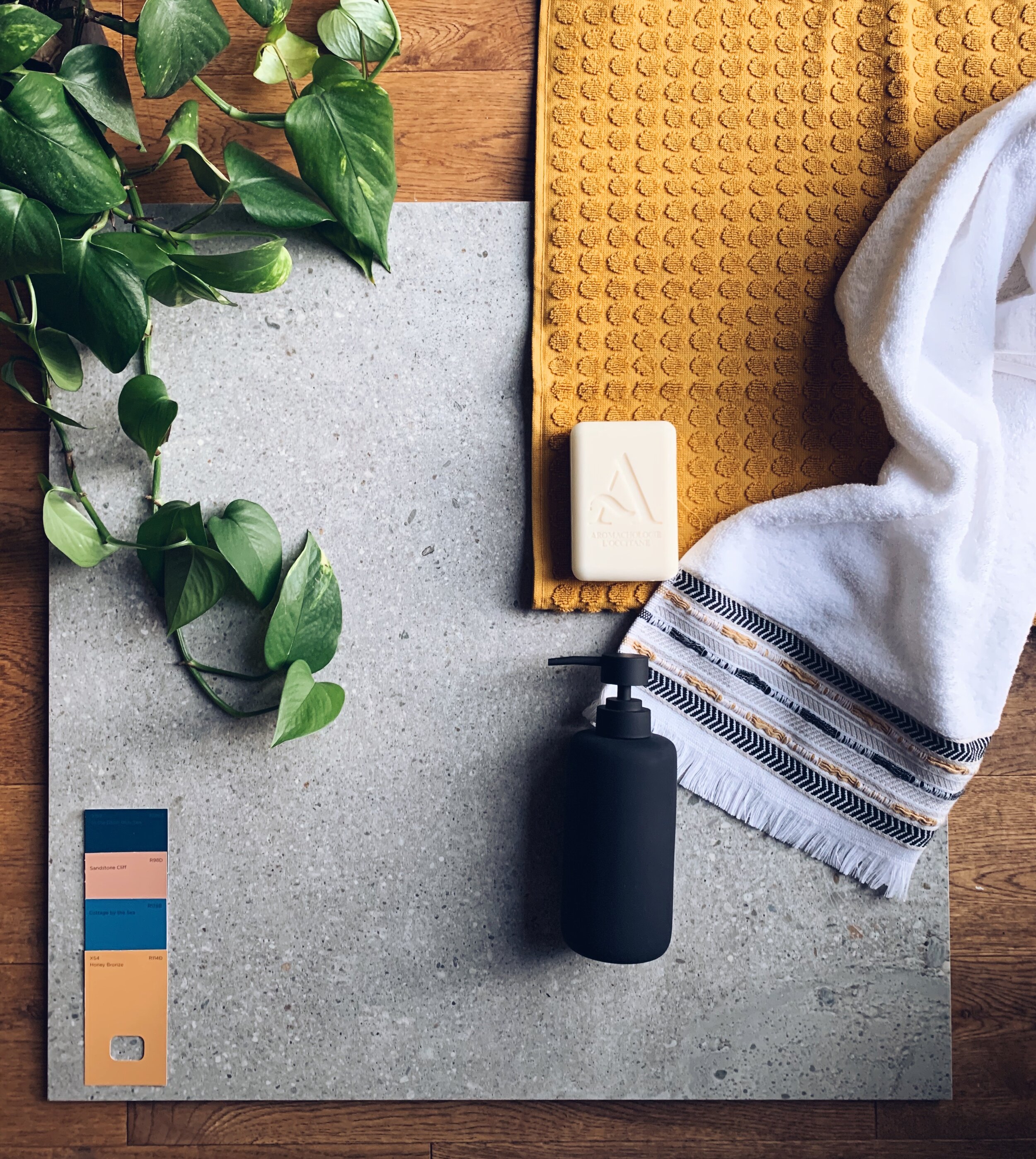
First up is a refreshing bathroom scheme epitomising everything I have seen over the last year at all the big design shows. Be braver and bolder with your bathroom decor and one way to do this is incorporating colour. These Commix Grey Tile have a concrete effect to them, acting as the perfect neutral backdrop to the pops of colour. As I have previously mentioned sunset colours have been huge in 2019 and look set to continue in 2020. From sunshine yellows to sun down rusts, when paired with matt black accessories, the yellow becomes sophisticated and less garish. I’m also loving pairing the yellows and greys with powder blues and pinks as seen in the CP Hart Showroom in Manchester.

C.P. Hart Showroom, taken by myself. Terzo Piano. Domus Group.

2. Wood Effect

Eterna Arche 105x600

Eterna Arche 105x600

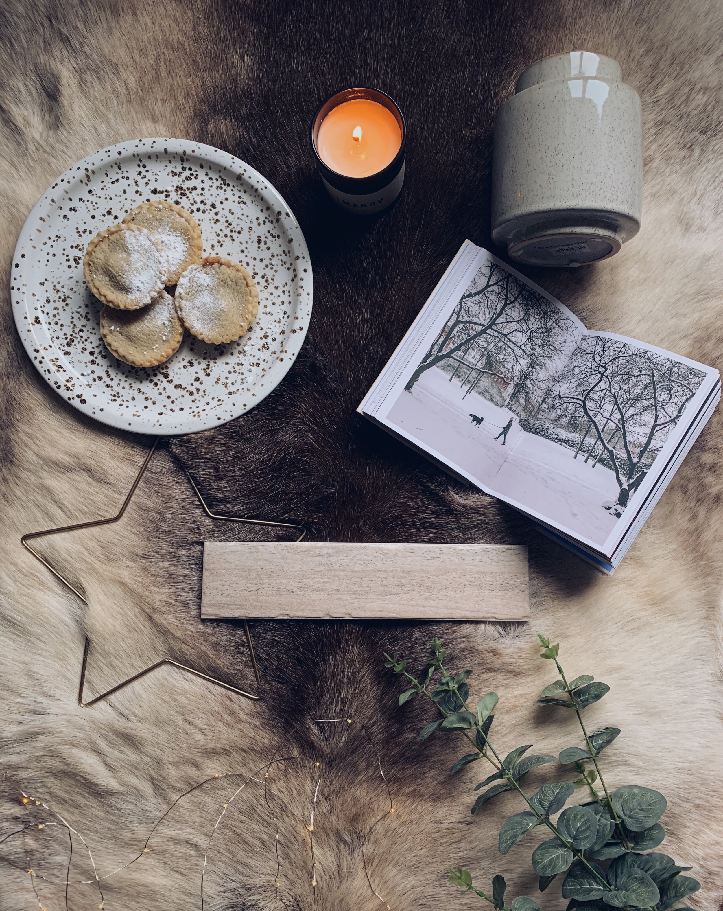
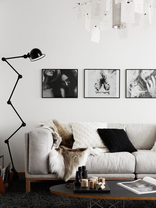
Next up it’s time to hunker down and embrace all things Nordic. Tile Giant’s Eterna Arche is a gorgeous cream glazed tile which is matt finish, making it a great choice for creating a wood effect style. To create a Hygge environment with these tiles, you should pair them with lots of layers and textures. Reindeer rugs, faux fur throws and candles create a really cosy environment for the winter months. Add some brass and fairy lights and you have the perfect space. Don’t forget the white walls, logs and black accessories for the mood too!

Outdoor house & garden. Adventures in Cooking. Shot styled by Pella Hedeby and photographed by Kristofer Johnsson.

3. And Just Because…

IMG_6326.JPG

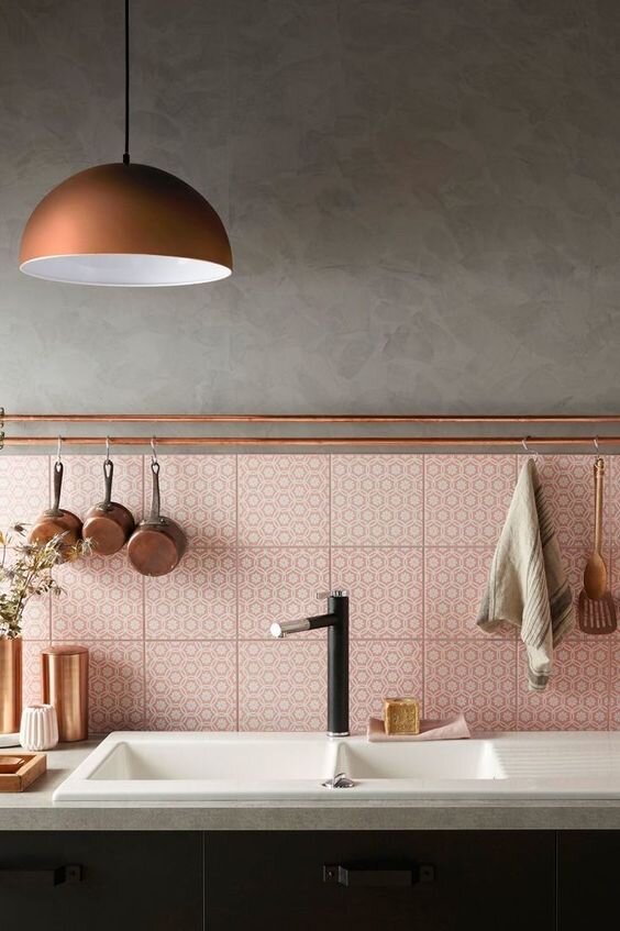
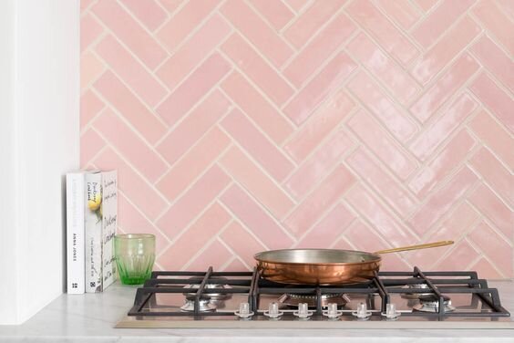
Last but not least I picked this Milan Rose tile because I still see pink being big next year. Pink becomes the perfect neutral when teamed with dark blue kitchen cabinets and copper accessories. Warm woods and terracotta tones come alive in the kitchen and the Milan Rose can act as the best kind of back splash. The tile can be laid in a traditional metro pattern, vertically or herringbone and give a different effect each time.

Cote Maison. Floors of Stone.

So for all your tiling needs, have a look at Tile Giant and see if there’s a tile for you! Happy Renovating!