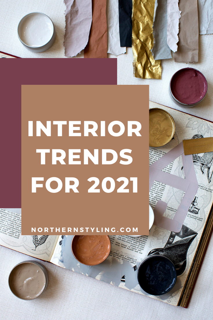


It will be hard to follow a year of pandemic but there’s always hope with fresh new ideas and designs to give our homes a well needed face lift for Spring. Here are my top picks of the Interior Trends of 2021.

Background image by Paweł Czerwiński
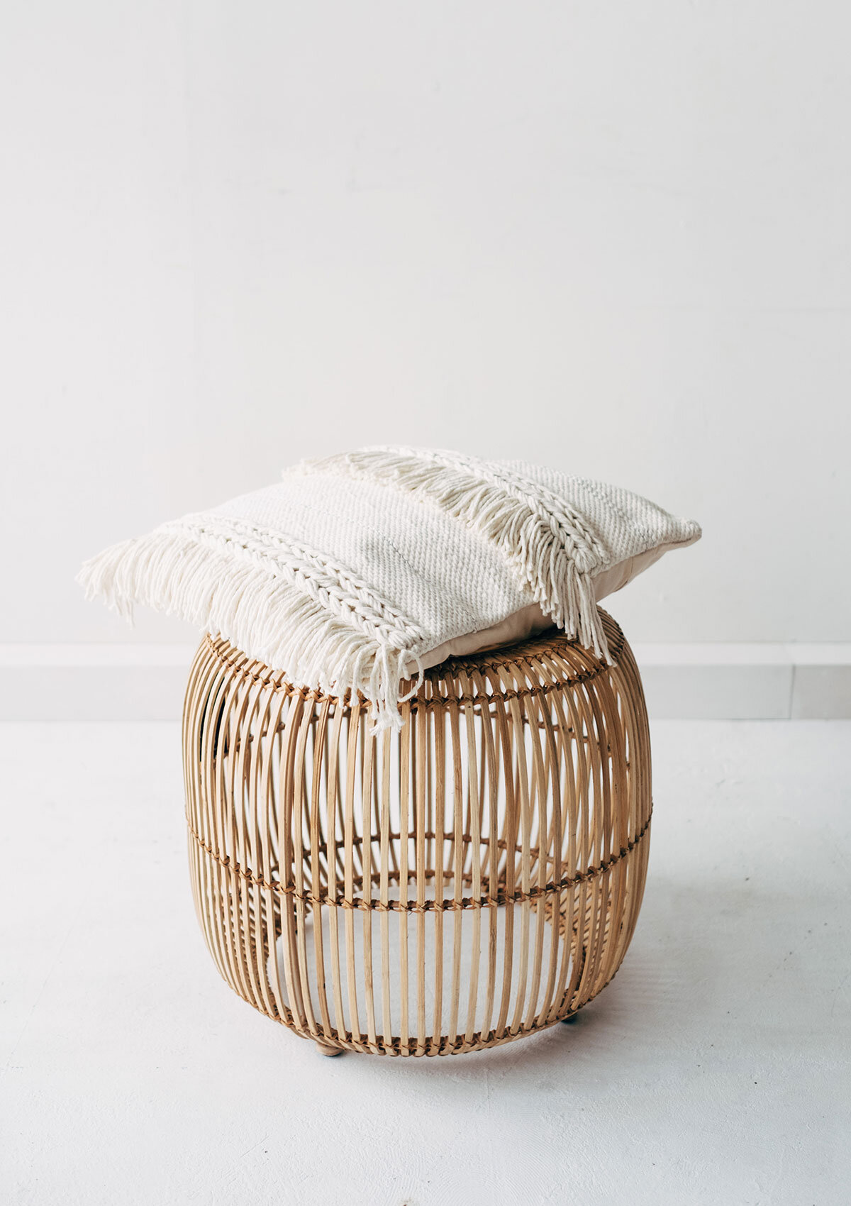
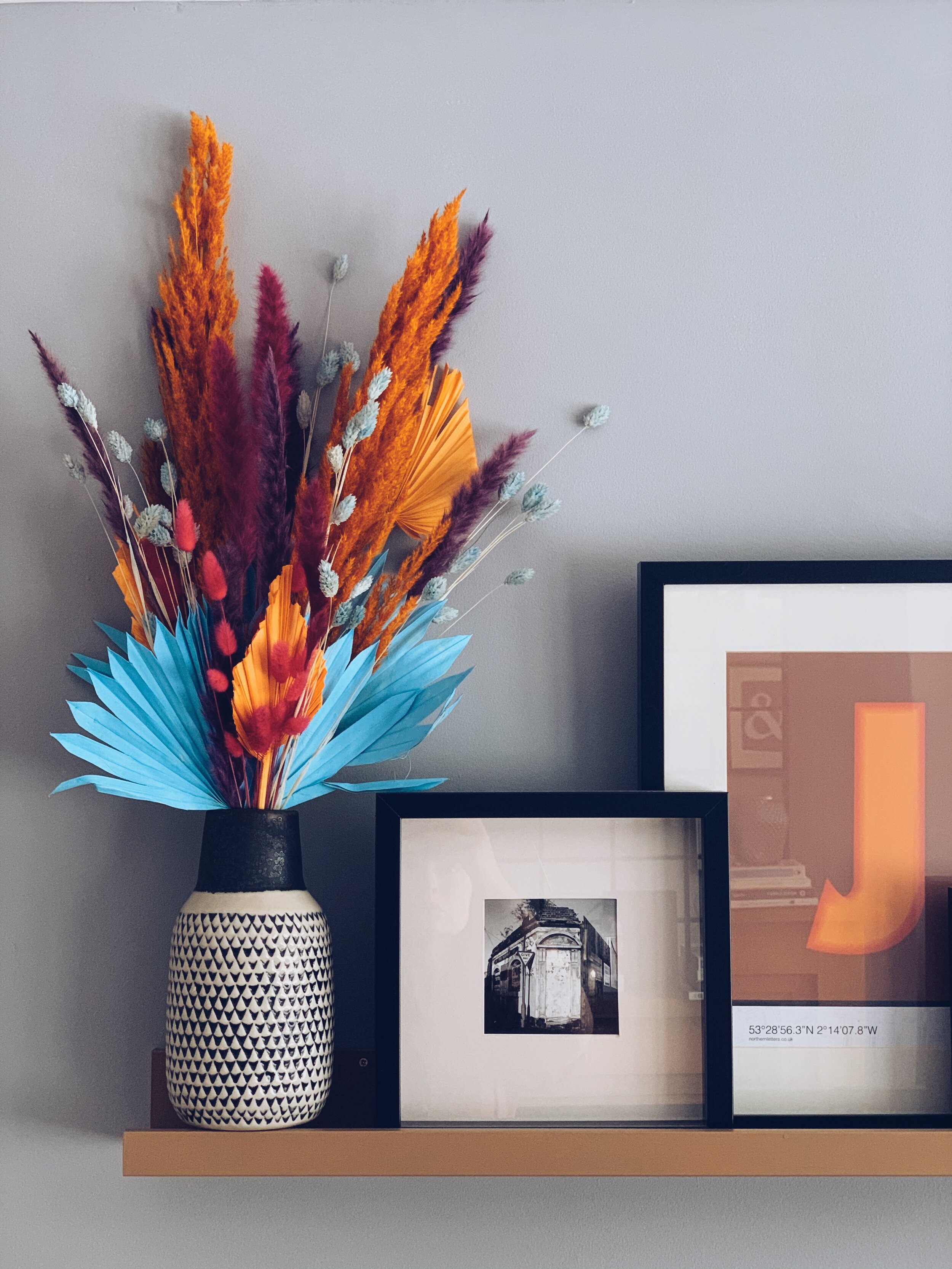
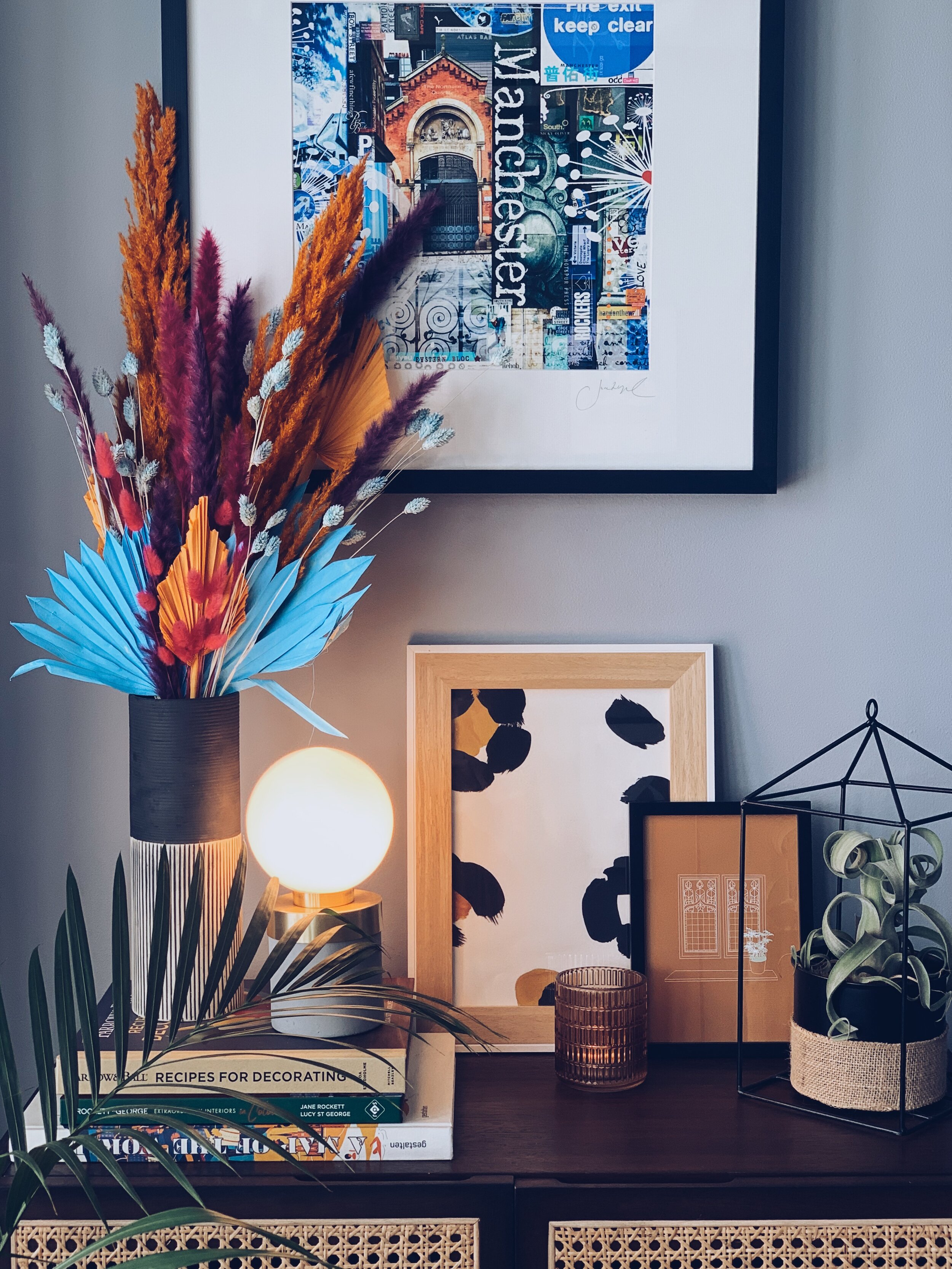
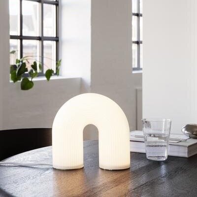
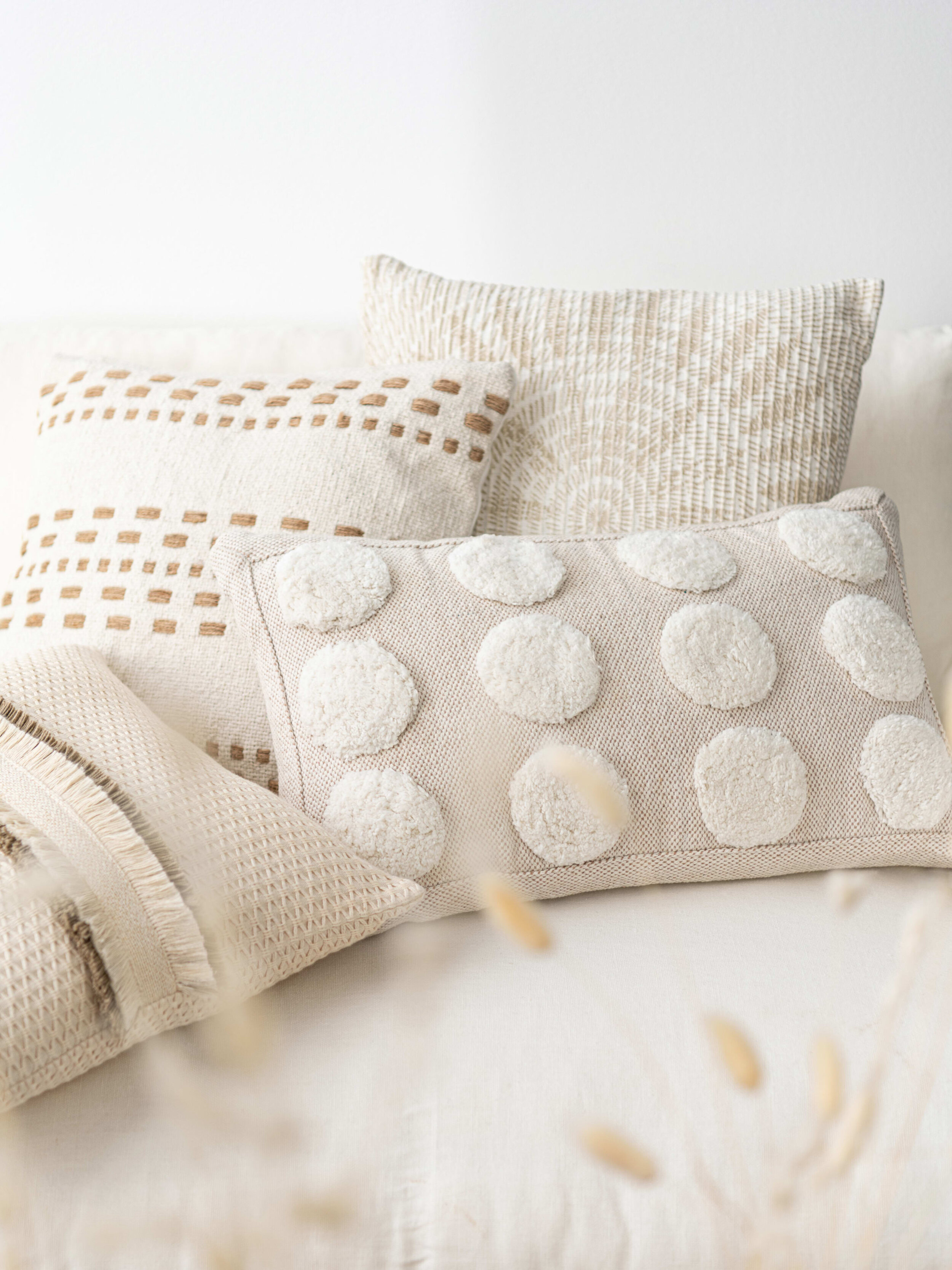
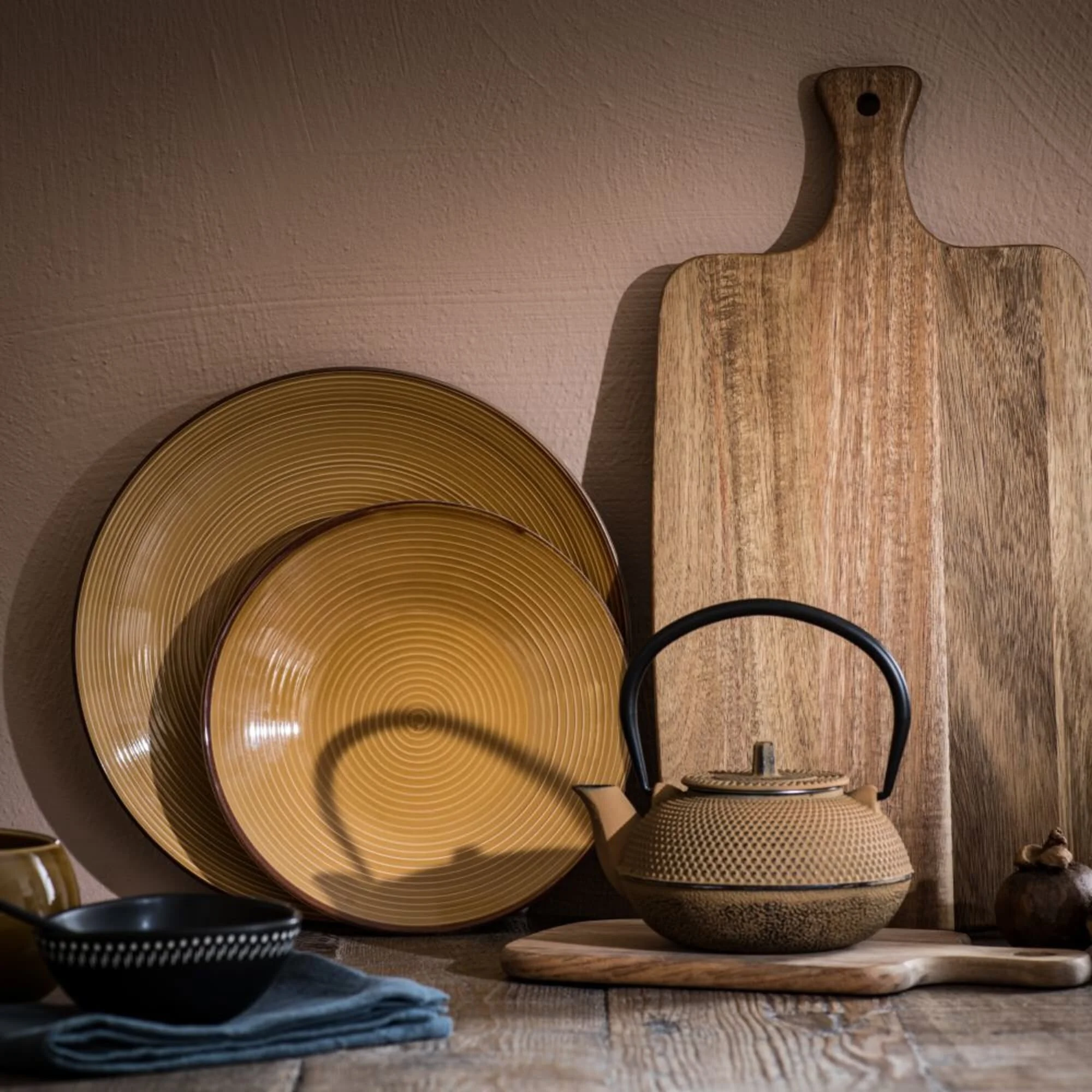
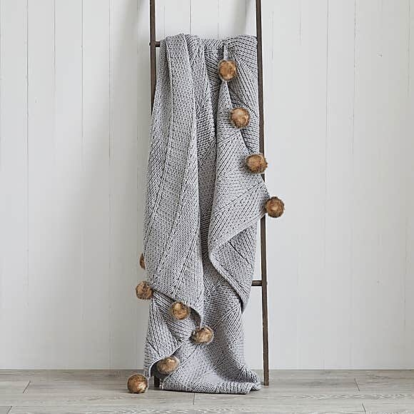
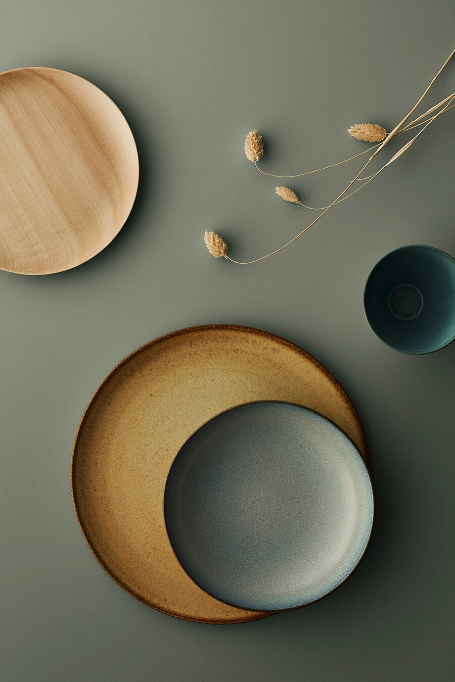
2021 is all about texture. From fluted cabinets to rippled tiles to boucle headboards. If it makes you want to run your hands across the surface then it’s doing it’s job. Bringing texture into our homes can instantly transform a room, whether it’s your favourite blanket or plaster effect paint - it has the power to envelope and create the cosiest of spaces. It also adds interest to the blandest of decor schemes.

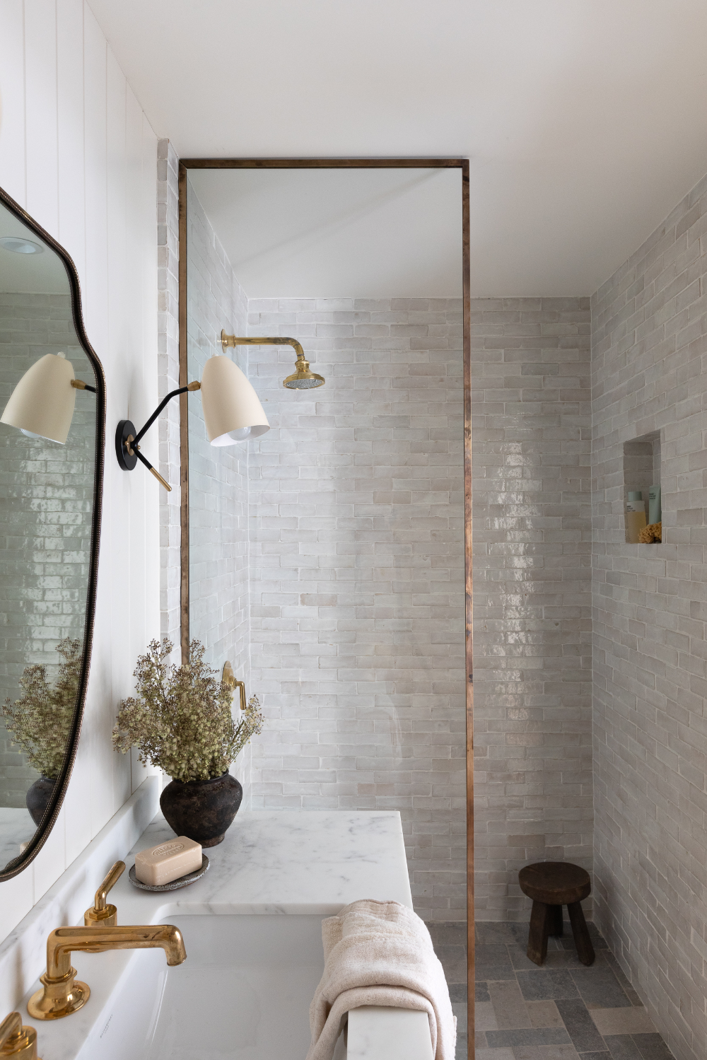
One of my favourite ways to add texture at the moment is through tiles in the bathroom. Reena from Hygge for Home is currently doing the most epic renovation on a bungalow and her bathroom is so dreamy. She has combined Zellige tiles with Tadelakt walls. Both hailing from Morocco, Tadelakt is a traditional waterproof and decorative plaster and Zellige are handmade tiles which give an uneven, authentic feel to any wall.

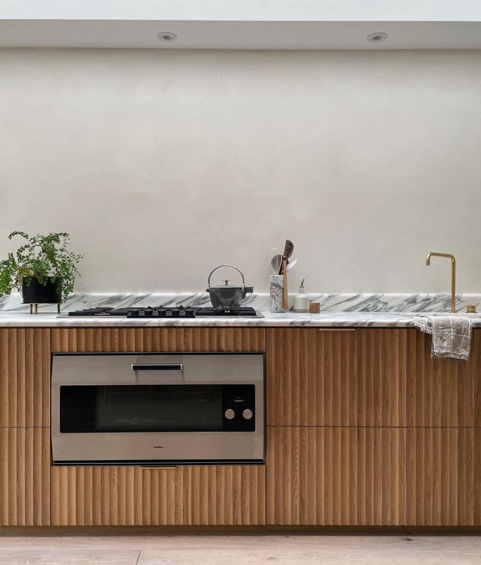
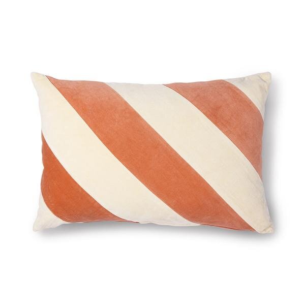
Other ways to add texture into your home can come in the form of T&G fluted panelling to frame a bed or ribbed cabinets in the kitchen. Fabrics like Boucle, Cord and Velvet are great additions in big or small amounts.
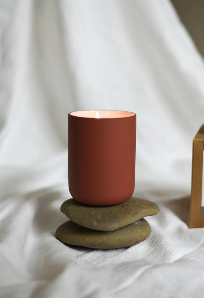
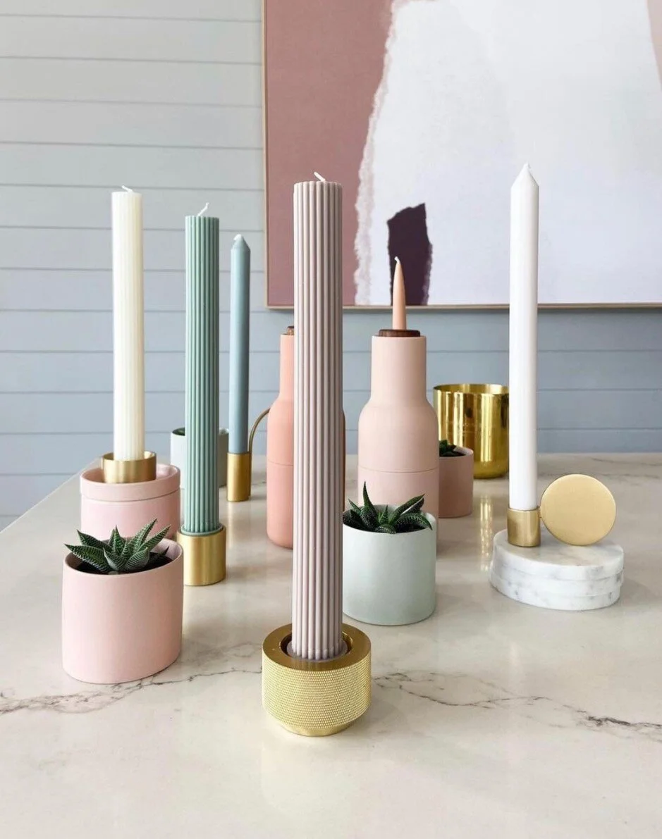
And if you just want to start small, then these candles from Norsu Interiors are a really quick and easy way to introduce this trend.

2020 shook everything up and it feels like 2021 is probably going to continue some of the habits learnt from the year before. It’s no secret that our homes have had to work harder recently - they have become offices, schools, retreats and restaurants 24/7. Most of the surveys suggest that workers, where possible, would like to continue a work from home balance of some sort so look out for clever home office as more ingenious ideas come through.
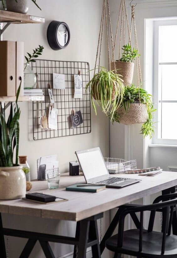
The most important thing is here to zone the space if you can. The ideal scenario would be a separate room where you can close the door behind you at the end of the day but, if like me, you are not lucky enough to have a room dedicated to an office then just simply designating a corner can help you distinguish where the working the day ends and the home life starts.

This spare room office design below by Luke Arthur Wells is a fab example of zoning the space by using an alcove corner and some simple panelling to frame the desk. The room is still a spare bedroom when needed, but functions as a home office perfectly.

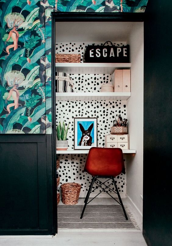
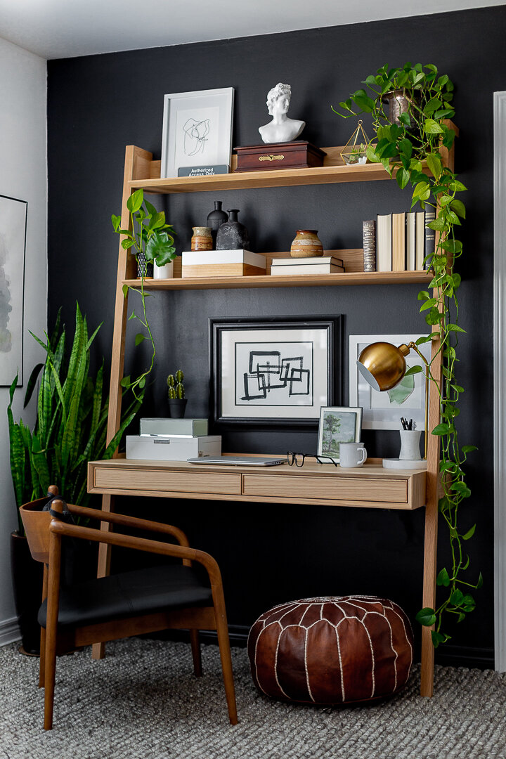
And Medina from Grillo Designs is the Queen of making spaces would hard to accommodate her family’s needs like this workstation she designed under the stairs for her son to do school work. It’s compact, neat and in keeping with the rest of the room. Notice the framing idea is used here too and it really works.

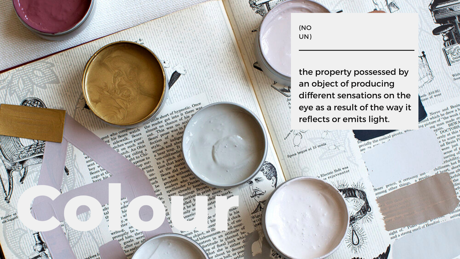
Image by Atelier Ellis
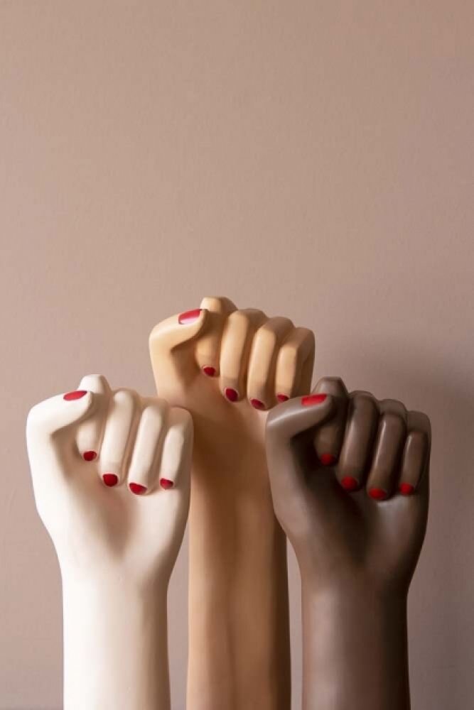
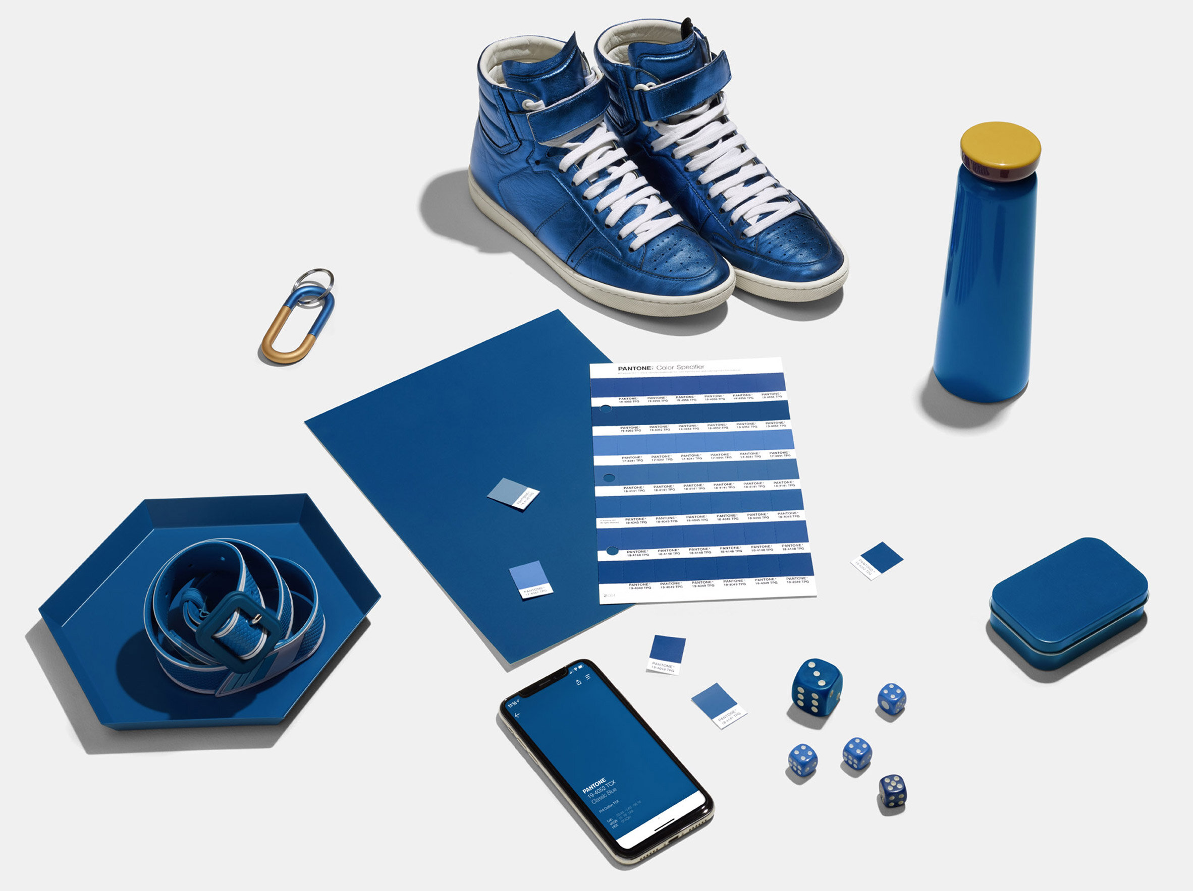
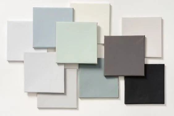
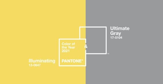
Every year we see colour trends come through from various paint companies and 2021 is no different. Dulux and Pantone are the leading experts on colour but there are many different colours to choose from if these particular colours aren’t your flavour. One thing is for sure, we are getting braver in our homes and I urge you to pick colours that make you happy rather than following the trends. If it’s something you don’t particularly like - don’t force it to work.
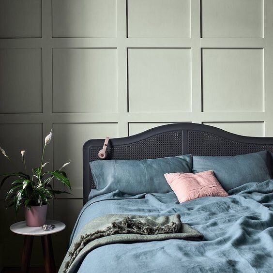
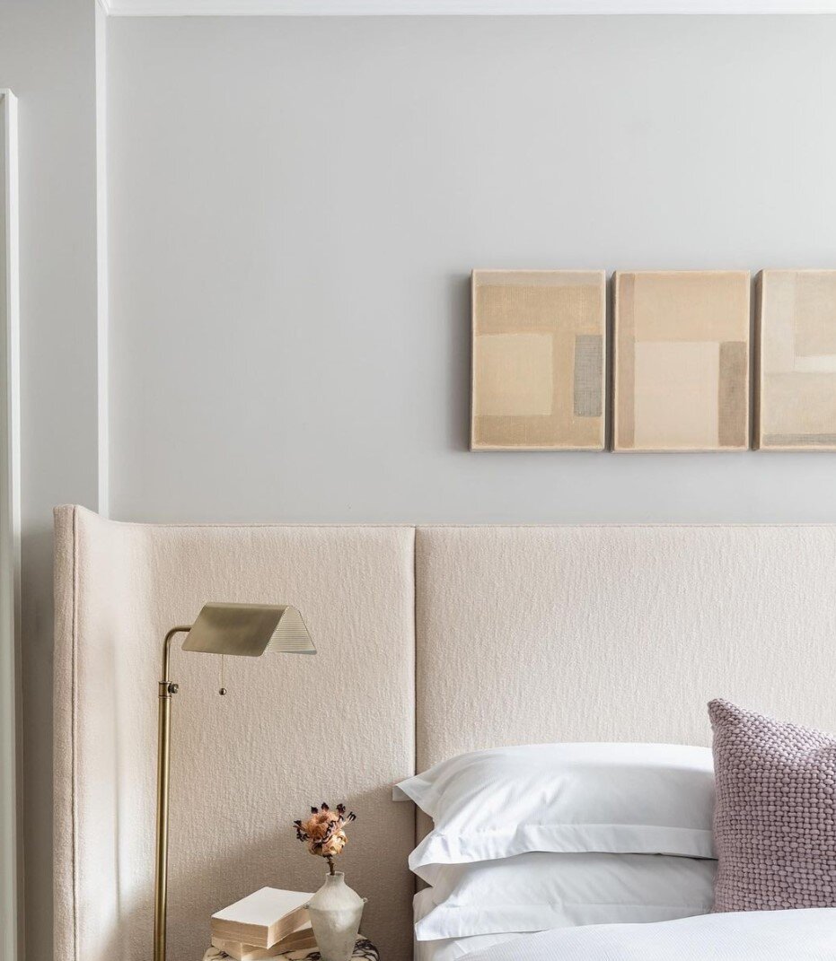
One colour that scares the hell out of me but also weirdly makes me happy is Lilac. If any of you grew up in the 90s you’ll probably remember the classic half and half lilac/turquoise combinations that adorned teenage bedrooms. Border wallpaper anyone? All those hideous memories aside, when teamed with moody blues and dusky tones, Lilac becomes sophisticated and works particularly well in small amounts - headboards, accent chairs…that kind of thing.

Elle Decoration by Crown Paints.
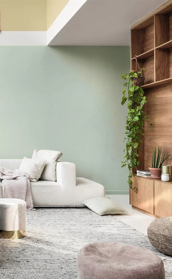
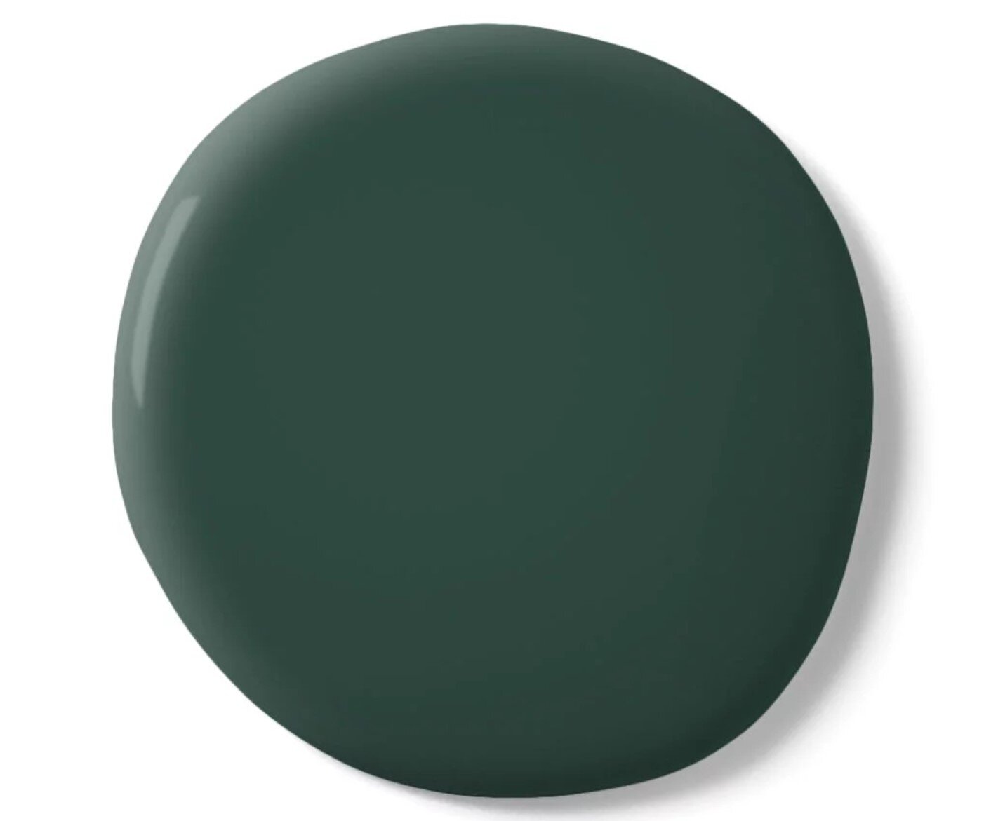
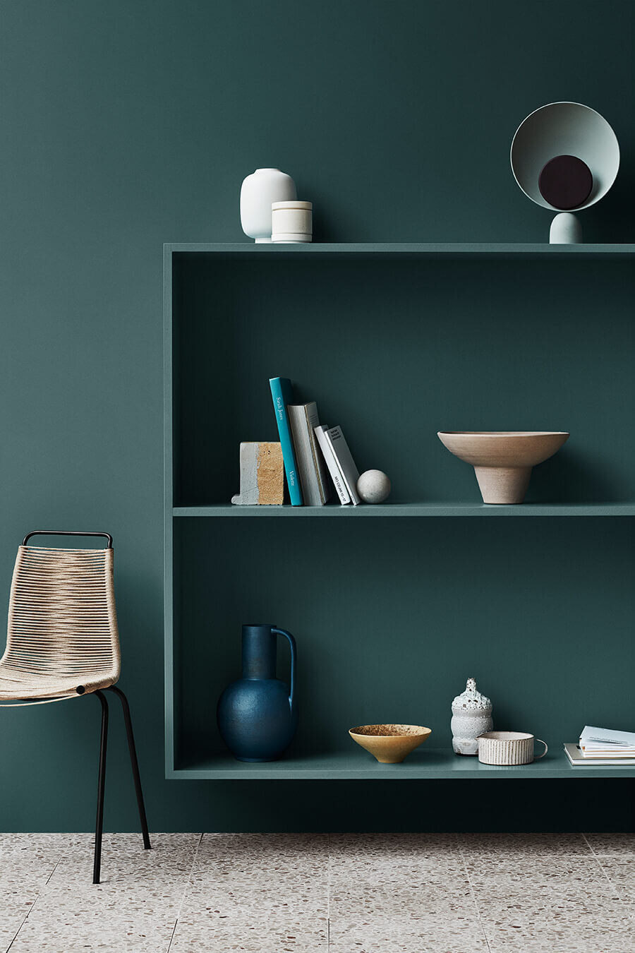
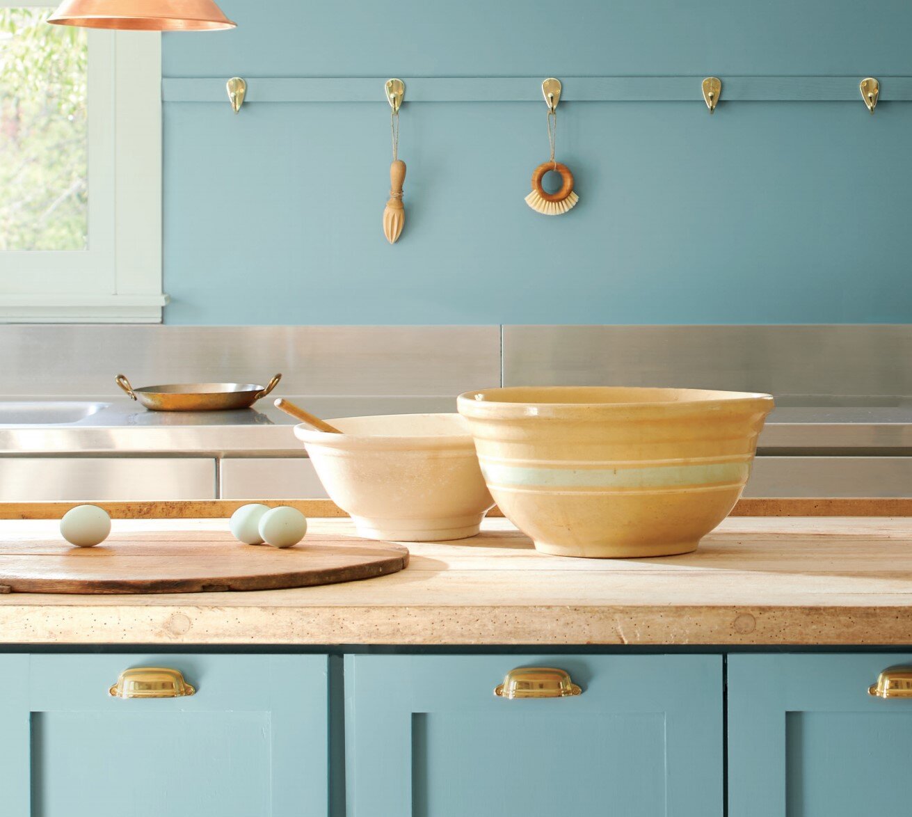
Green is also growing in popularity, some people are even saying it’s the new grey. Using green as a neutral is a brilliant way of installing tranquillity into any home and adding lots of plants is a perfect combination.
On the deeper scale of Green is Emerald Green which works as a brilliant colour pop. I particularly like it on Casa Curated’s art deco inspired bed.

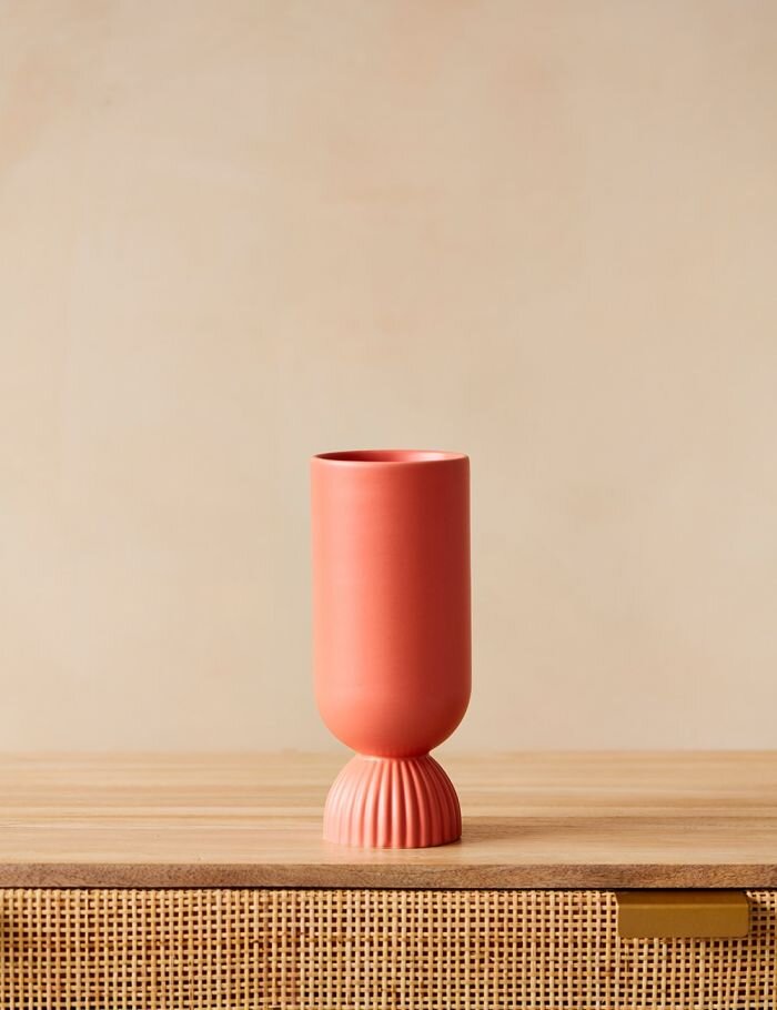
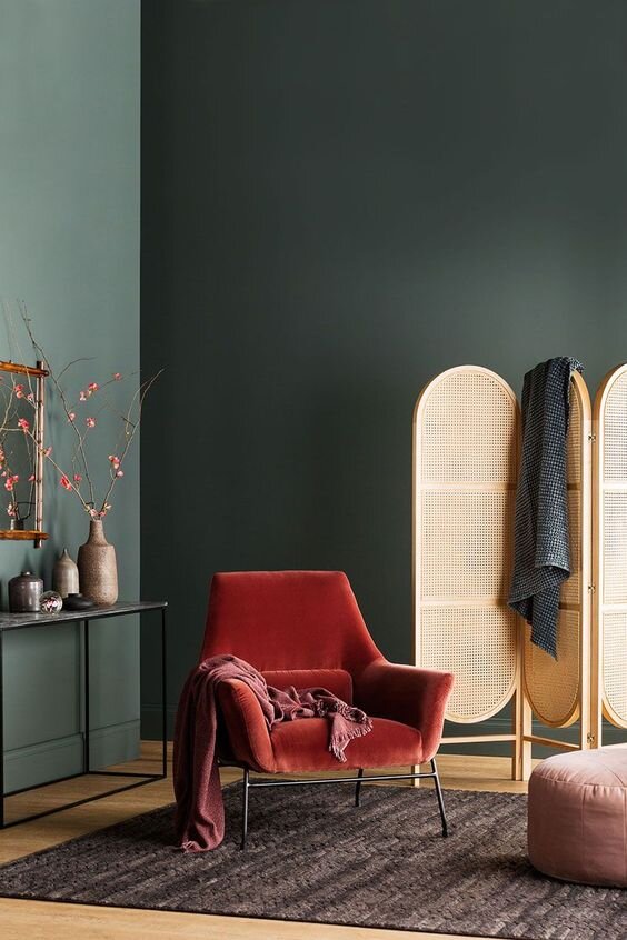
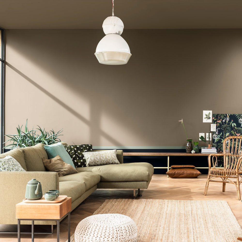
And finally I am still in love with the warmer tones whenever I see them. Here is a brilliant pairing of Desert Rose and Caddie by Paint and Paper Library. The thin splash of black on the dado rail grounds the colours and adds just the right amount of contrast.

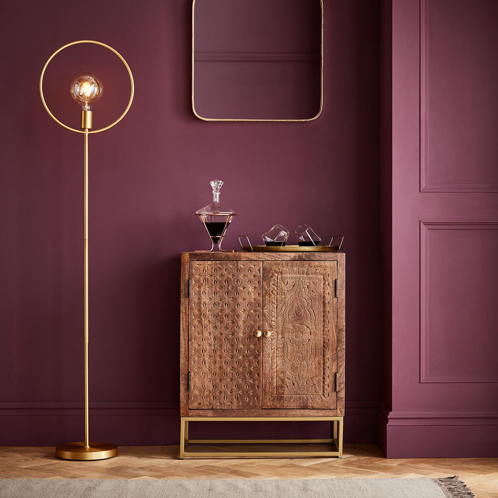
Paint and Paper Library
So that’s my top picks for 2021. I would love to know your favourite and if any have inspired you to use them in your home. Let me know in the comments below or my DMs are always open on Instagram.
Have a fab January!