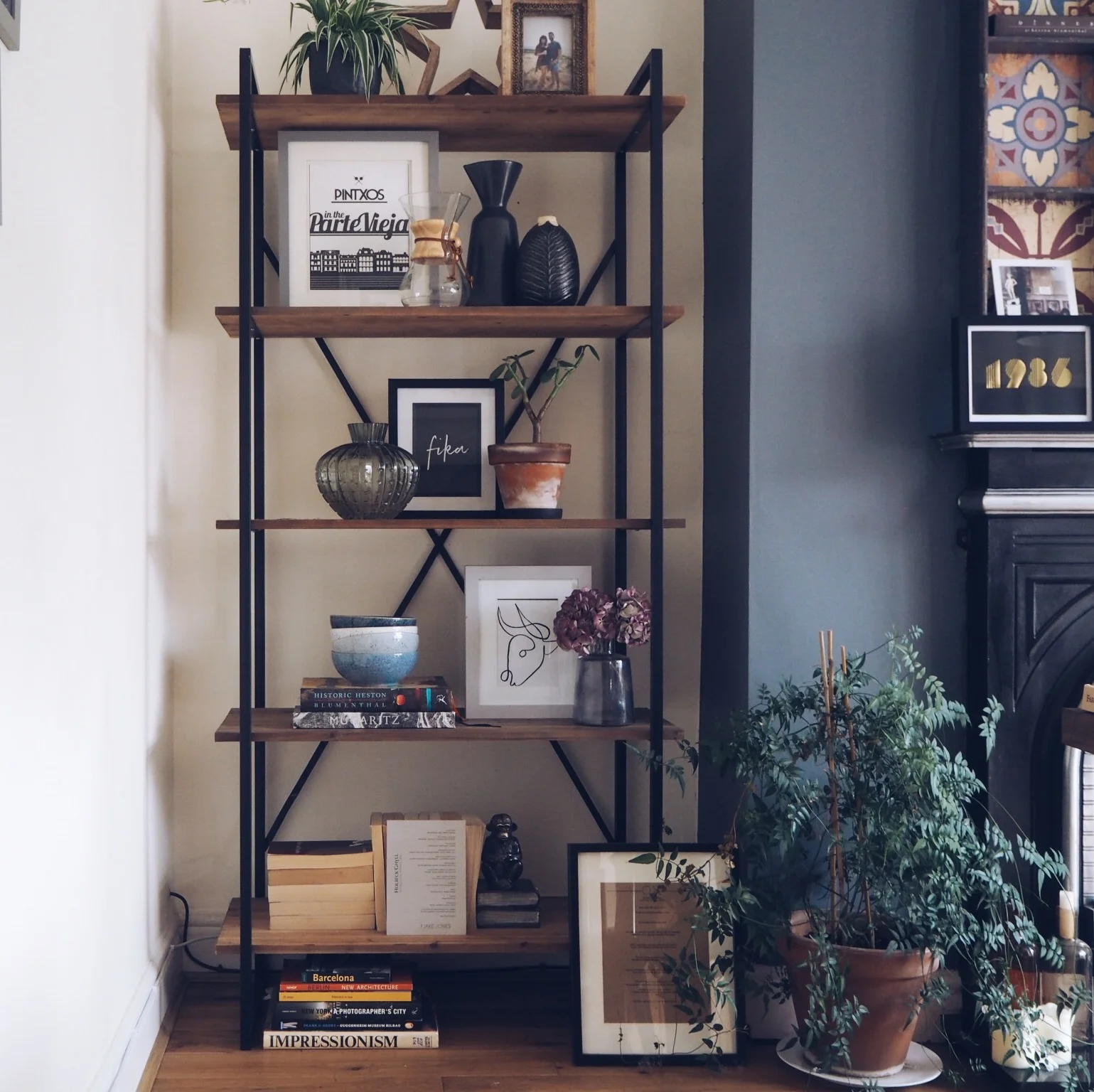
Some people think updating their homes means spending lots of money on repainting or buying a new sofa. I find that simply moving objects around really helps the home feel fresh. I have updated my shelves in the dining room and I’m going to show you a few simple tricks and tips without spending a penny. I have just used items already in my house, had a little faff and found the room looked instantly new!
Before
There’s nothing wrong with the shelves how they were, they have just been like that since January and I decided to change them up a little bit.
First things first - strip the shelves completely. Sometimes I do just swap one object here and there so it’s not necessary to strip it every time but I really wanted to go different so all clutter had to be moved away. I didn’t take a shot of the dining table during this but it’s not for the fainthearted!
During
The main reason for updating the shelves was to make a feature out of some of the prints we’ve collected from our holidays recently. The Bull print is from Malaga 2018 and the Pinxtos print is from our very fabulous weekend in San Sebastian at the beginning of June.
The diagonal line in which I’ve laid these prints out is intentional, it spreads out the bulkier elements so the unit doesn’t feel too heavy. I’ve added in my little plant that my best friend gave to me - he’s growing so so slowly but he’s still alive which is good news!
Next I wanted to move a plant from the kitchen shelves to be more focal here and also to keep adding pops of green. Plants really help bring a space to life and if you can keep them alive then I would highly recommend having them in your home. It’s not secret about the well-being and health benefits plants give us too.
As a rule of thumb, objects look better in groups of threes. I’ve brought in my Chemex and Ikea coffee pot for no other reason than I love these as objects and shapes. The green vase kindly gifted from The Flower Lounge also helps the continue the “green theme” and the bulbous shape also goes with that of the Chemex.
Next comes the books. Mixing in cookbooks and normal books help tie the dining room and kitchen together. Are you even an ‘Instagrammer’ if you don’t have the pages facing forward?!? I love the neutral tones it brings to the shelves instead of the colourful spines but it’s also to hide all the dodgy books I read -twilight anyone?!?
You can see I’ve add my wooden Nkuku star on the top shelf here too, I love this star but it is really big so by putting on the top shelf, it doesn’t dominate the whole unit.
Time to bring in a few more finishing touches. These Denby bowls tie in the blue/grey feature and also add an eclectic feel. You don’t have to match everything if that’s not your bag, you can just go with whatever you like and it really brings out your personality. Don’t be afraid!
I also love this menu print which was here before, the brown against the blue, for some reason just makes me happy so I decided to bring it back. Framing menus is one of easy ways to create artwork and you can read other tips here.
After
The finished article. A couple more books, a photo of me and Ben, and my beloved dried hydrangeas fill in the gaps. Also bringing my Jasmine plant from the other side of the fireplace gives the sense that it’s always been this way.
My 1986 print from Toodle And Pip now sits on the mantle and voila it’s done!
My Top Tips
Dress one shelf at a time but constantly take a step back to view the unit as a whole so everything looks balanced.
Use the rule of threes as base. Objects always look better in threes but don’t be afraid to occasionally break it as I have done on the 2nd shelf.
Choose objects that you like as well as functional objects. Add in prints, pictures and books to give your shelves a touch of your personality.
Have fun re-homing the other objects that were here before. That’s the great thing about refreshing one area, most other areas get a mini refresh too!


