3 ideas to keep the Christmas Spirit alive in lockdown.
Styling An Autumn Table
It’s my favourite time of year - Autumn, October, Halloween, Bonfire Night - I just love them all! I have so many happy memories of this time of year and not even a pandemic is going to stop me from decorating the house - even if no one is allowed round to see! I spent a Sunday afternoon styling my dining table just purely for joy and I thought I’d share it with you!
Pumpkins galore!
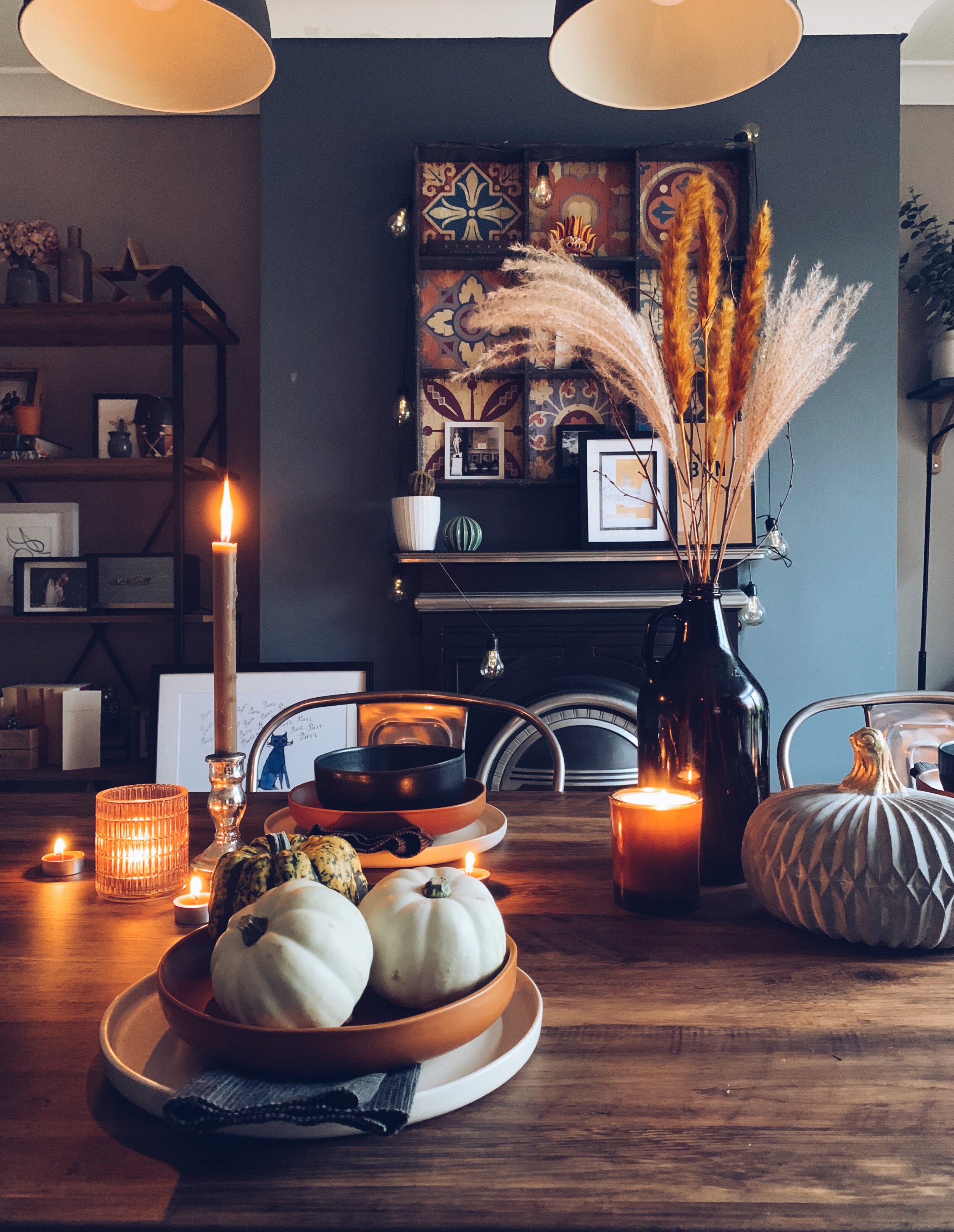
The secret to this table styling is to start with the centre and work your way out. I chose something with height - this time the jug with some lovely rust dried flowers and slapped it right in the centre of the table.
Then I used the rule of three to create a centre piece. Bringing in my favourite Home Sense concrete pumpkin and a Plum & Ashby Candle, I have 3 objects all with varying heights but with a general circular shape to bunch together for a great cluster.
Autumn Dinner Table Styling
Then I created a symmetrical shape by introducing dinner candles and glass tealight holders on either side of the “centrepiece”. These objects don’t match but they have the same purpose which gives an eclectic feel to the table.
A sprinkling of tealights weaving in and out of the other objects down the spine of the table suggest a rustic vibe rather than a rigid “can’t touch” feel. I have used Next’s Pumpkin and Ginger tealight candles and they smell DIVINE!
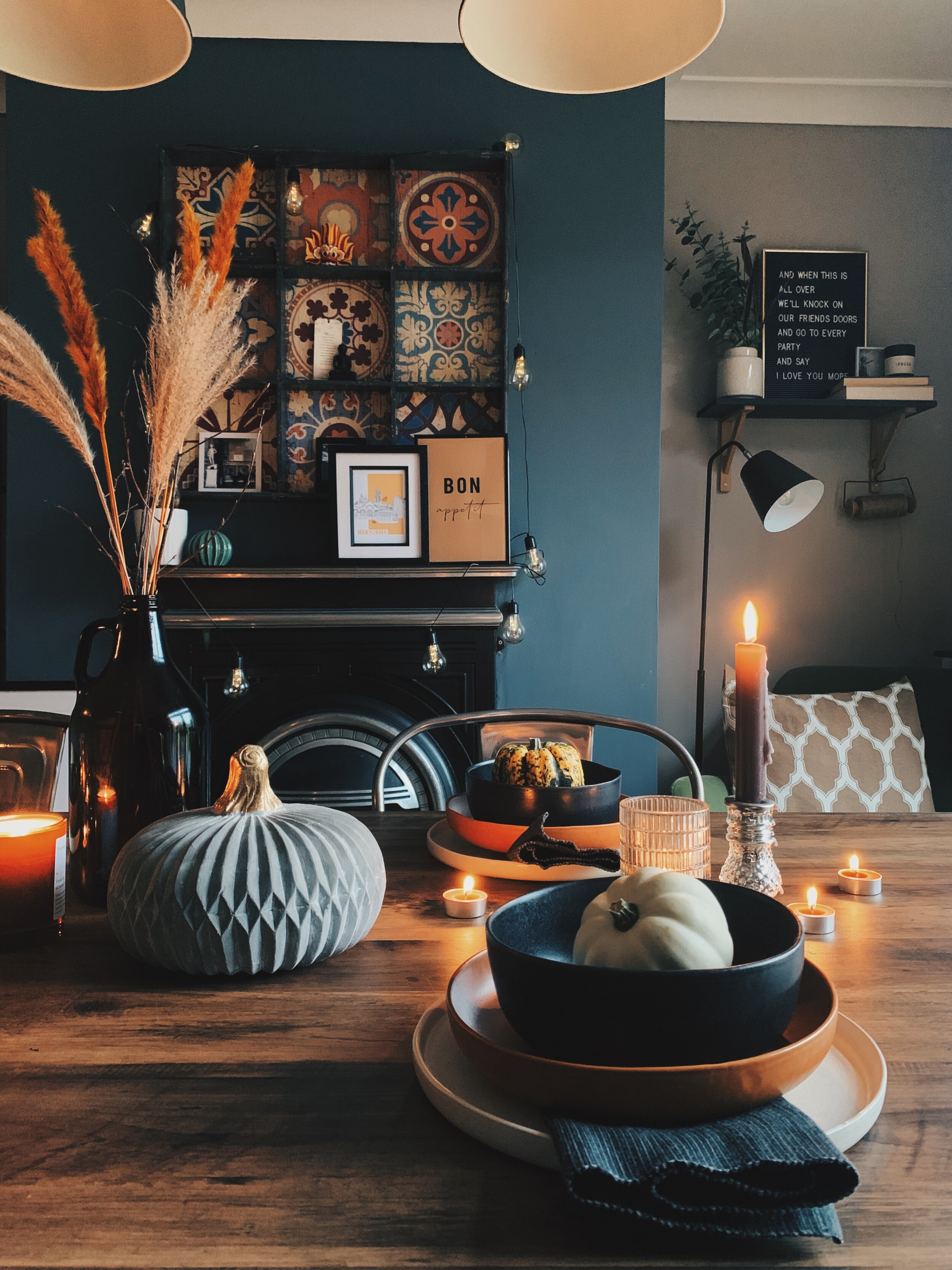
Finally I have stacked stoneware plates and bowls into four place settings around the table. Folding some fabric placemats and tucking them under the bowls adds a finishing touch to the place settings. I have used the Made.com dinner set which were gifted to me at the beginning of the year and are my favourite thing. The colours are also perfect for an Autumn Dinner setting and I love that they don’t match.
Pumpkin’s used as decor on dinner table.
The finishing touch to make it super Autumnal or a grown up Halloween style are the pumpkins. These can be used as name cards - grab a marker pen and write your guests name on them. Or just simply a talking point around the table. I love the little munchkin pumpkins that you can get from any good florist or even your local supermarket.
Pumpkin place settings
So there you have it. I hope I’ve inspired you and I’d love to see your creations. Don’t forget to tag me and I will share on my Instagram.
Bojangles approves!
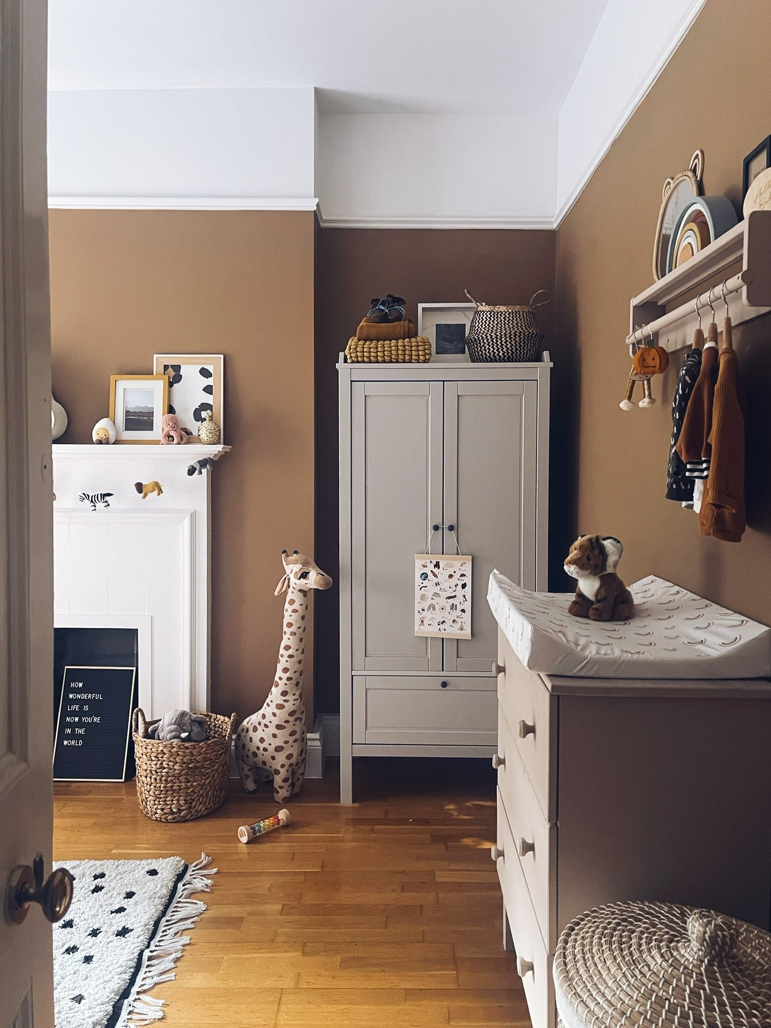
Trend Alert! Brave Ground by Dulux
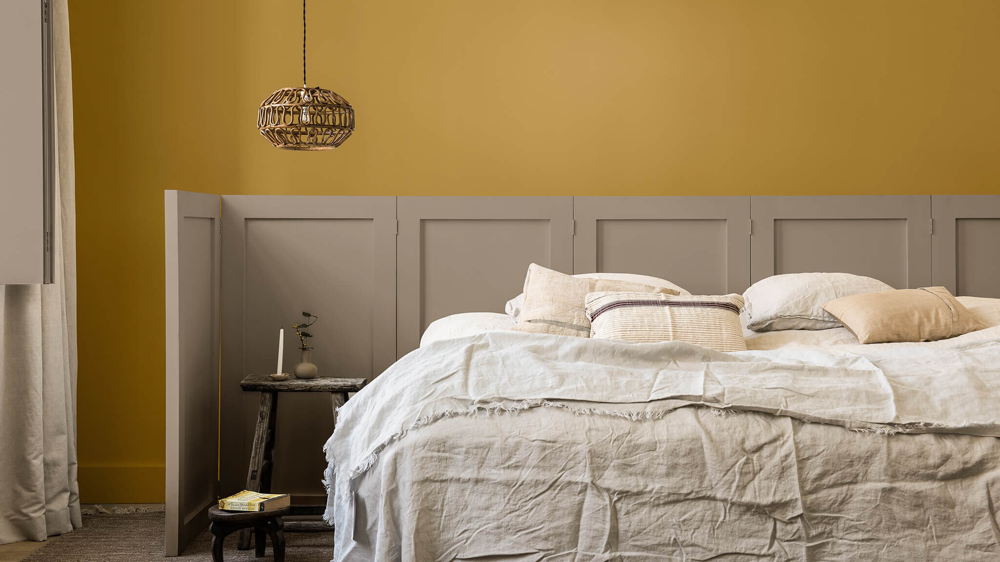
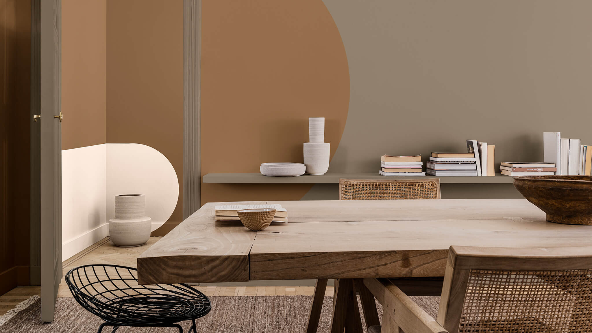
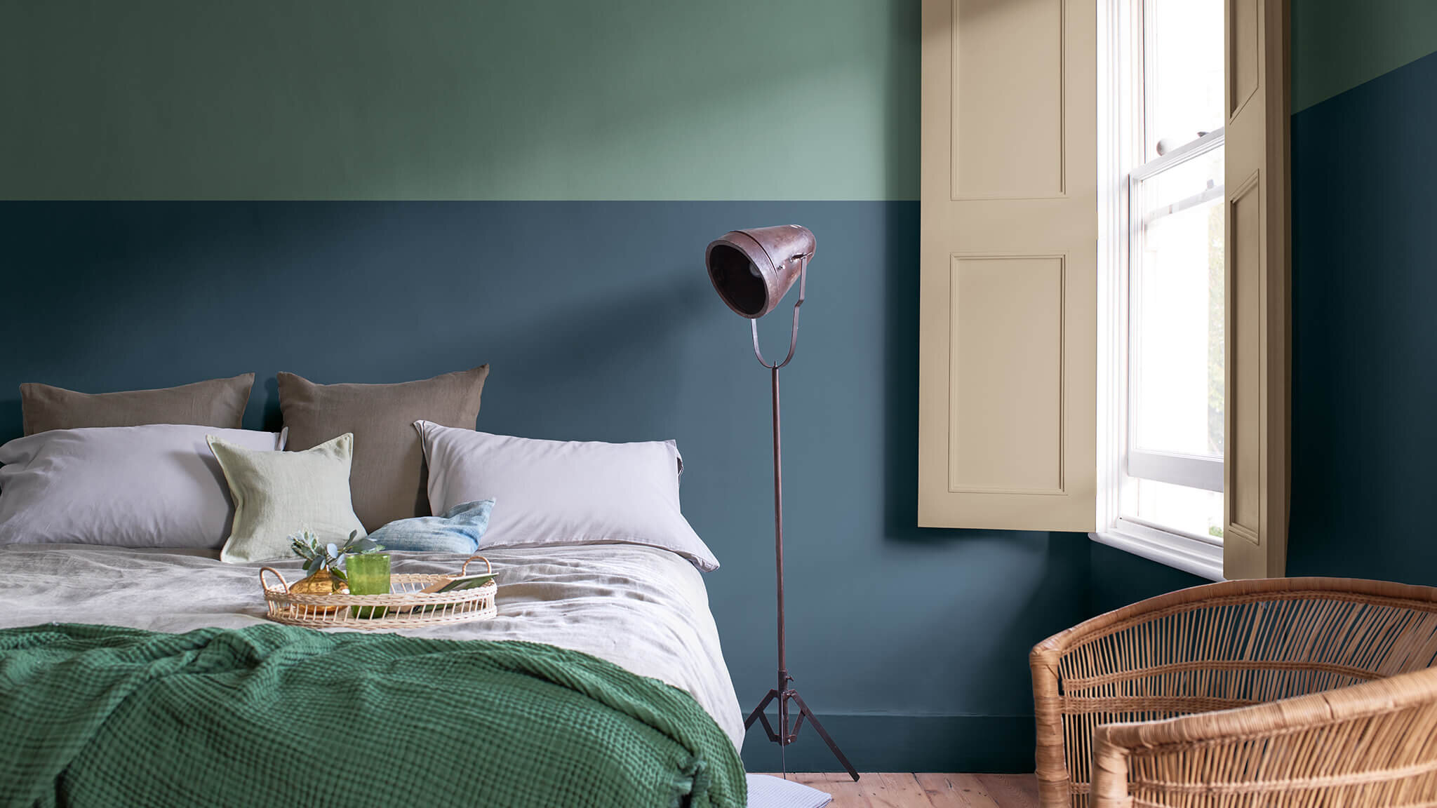
All Images by Dulux
I always get excited at this time of year because the paint companies start releasing their predictions for the following year. It sets the president for everything interiors, from wall colours to accessories and I love seeing how it develops over the year. From being a marmite choice to something everyone has embraced, colour is an integral part of our homes and I love the psychology and science behind the choices.
Dulux are one of the leading experts when it comes to all things colour and what our homes will look like in the coming year. 2020 - what can we say? No one expected what was to come and Brave Ground for 2021 is the perfect reaction to what can only be described as a shitty year!
Dulux Colour of The Year 2021
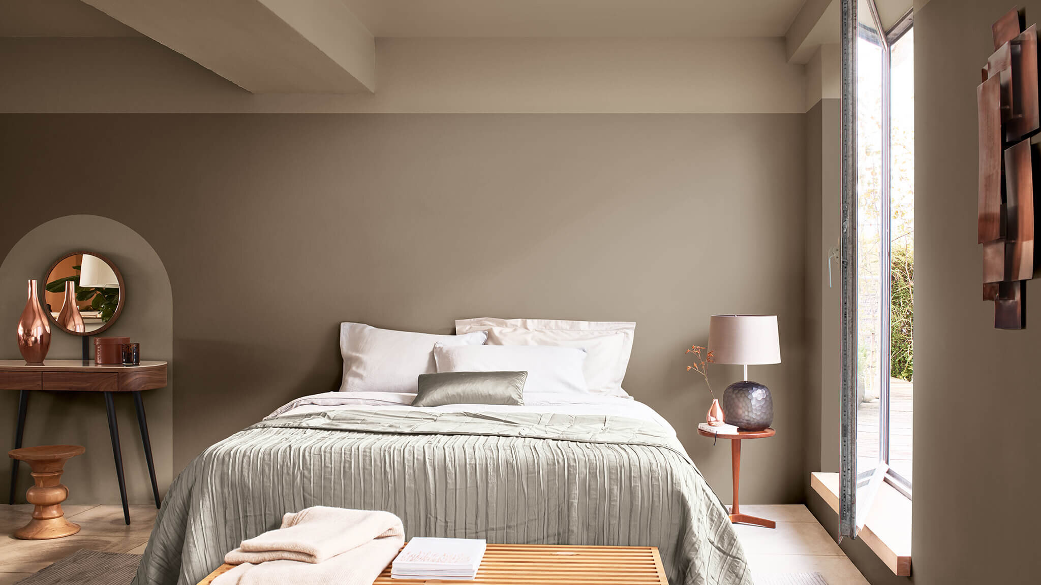
The experts at Dulux have identified the “warm and grounding neutral shade of Brave Ground as the colour that will enable people to draw upon the strength of nature to help them find the courage to embrace the future.”
The interesting thing about Brave Ground is that it flexes in tone depending on the time of day and setting, creating a subtly responsive environment so everyone’s rooms will have a different reaction.
The colour is warm and nurturing, evoking feelings of comfort and has endless colour palette opportunities.
Brave Ground by Dulux
Trust.
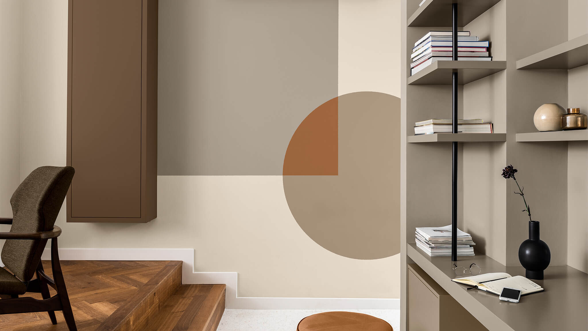
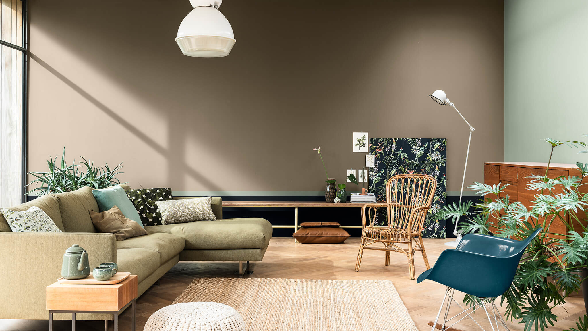
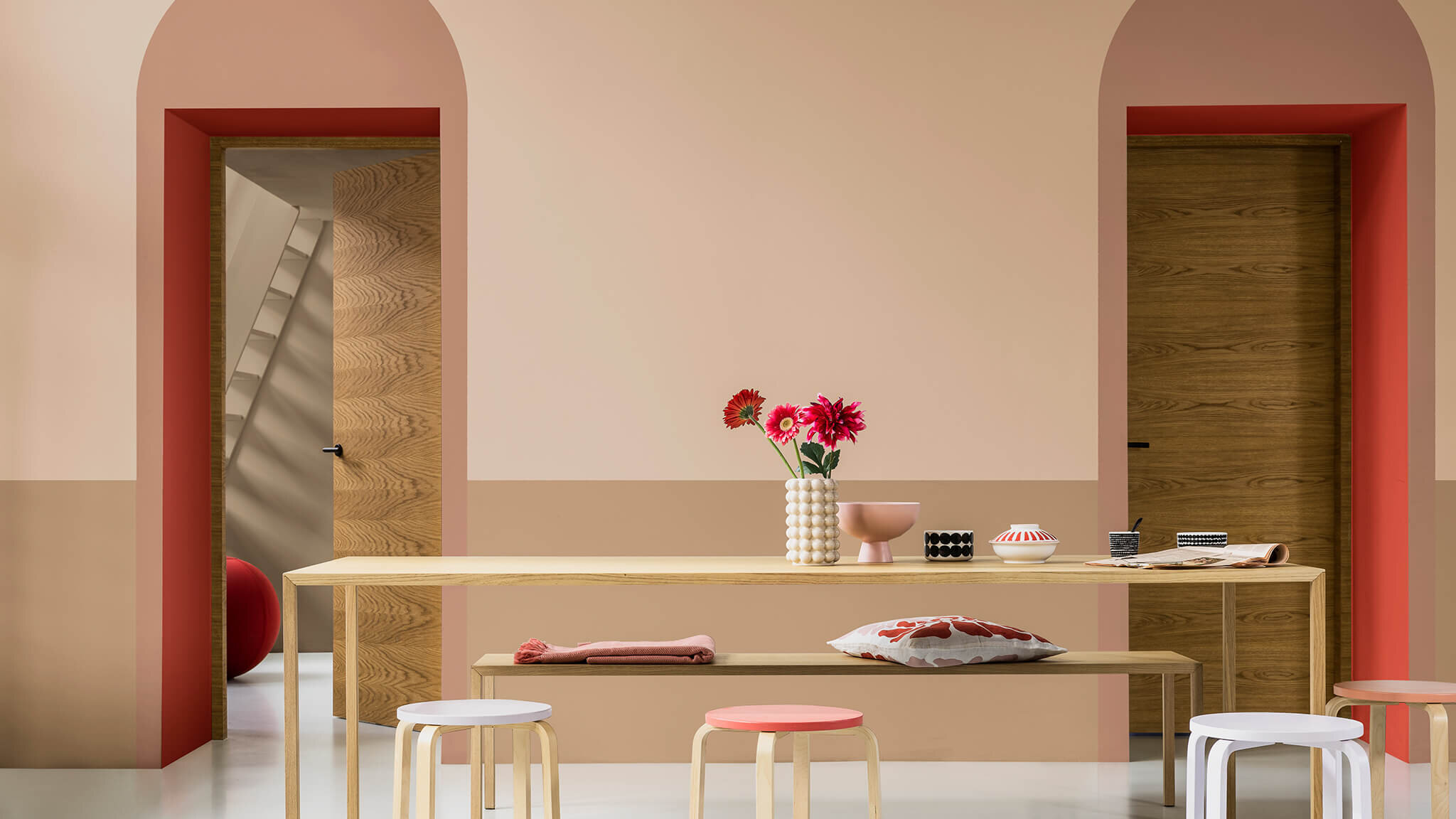
The Trust palette is probably my favourite palette of them all because it’s full of warm neutral greys and browns - and those deep terracotta’s which I’m always drawn to. According to Dulux “these colours complement each other and encourage connection, collaboration and a sense of harmony in the home.” And I couldn’t agree more.
Timeless.
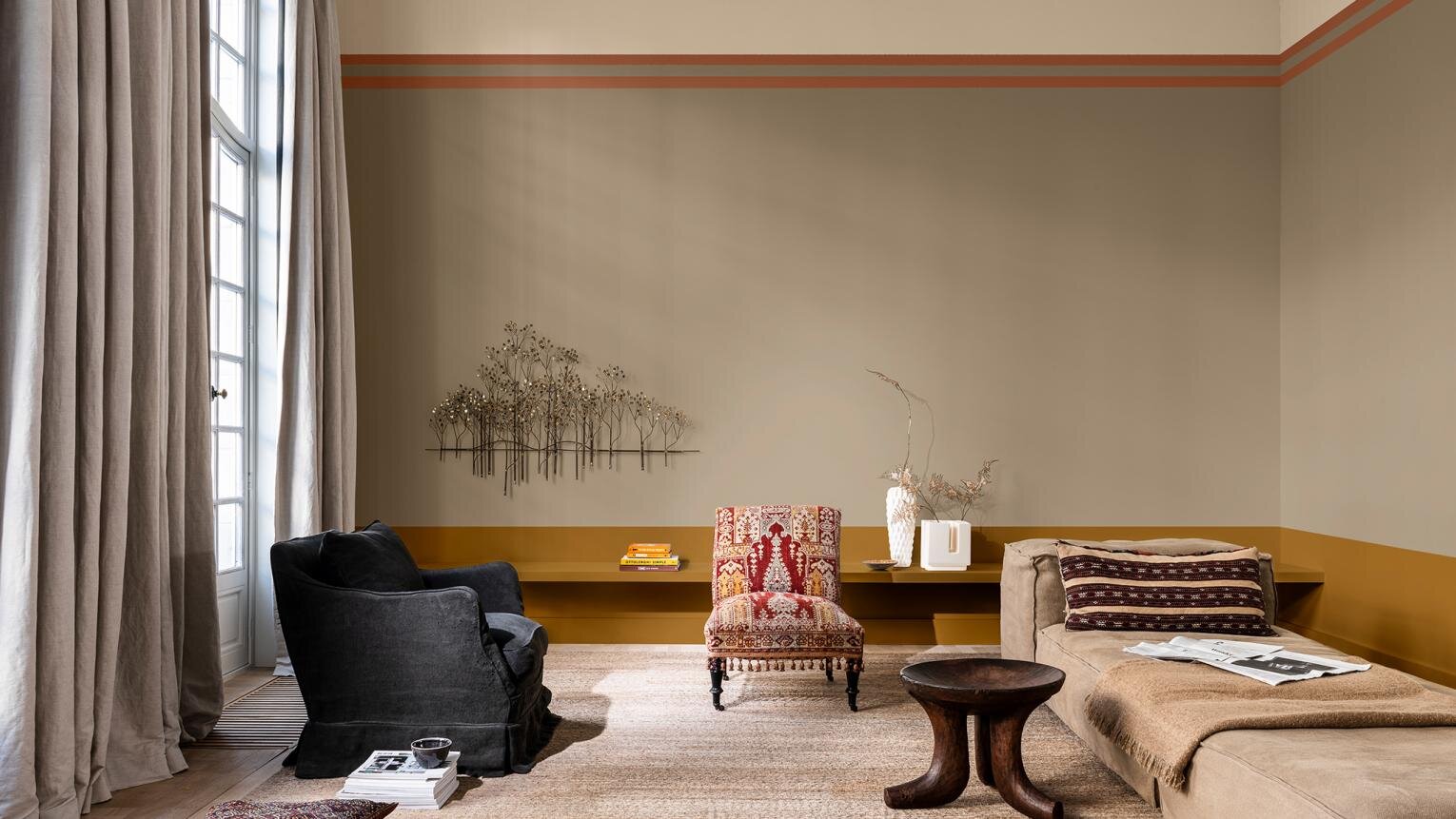
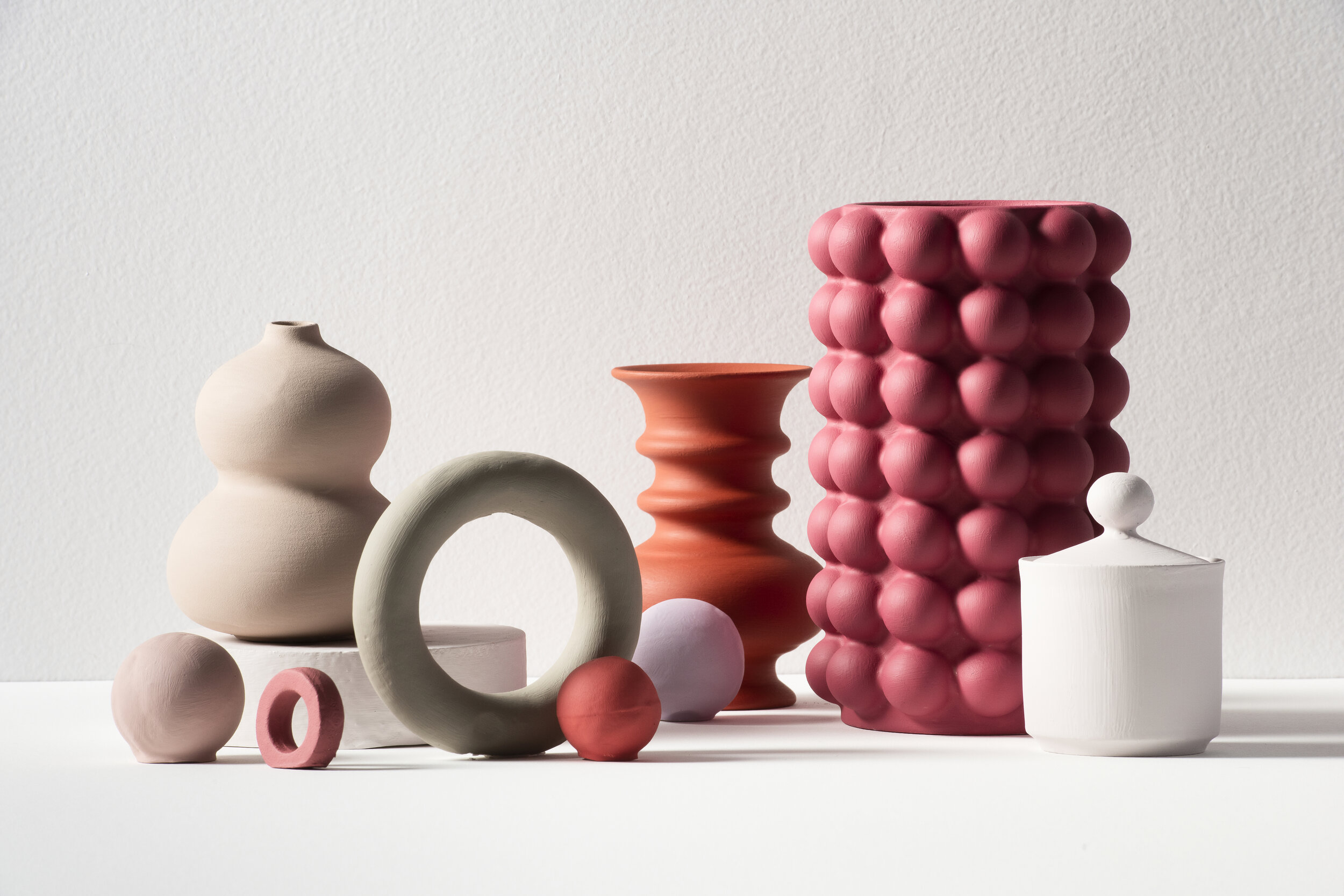
Timeless is full of energizing shades against soft neutrals which combine to create a backdrop of old and new. The pops of ochre mean this palette is anything but boring, yet it holds on to the heritage feel of the past.
Earth.
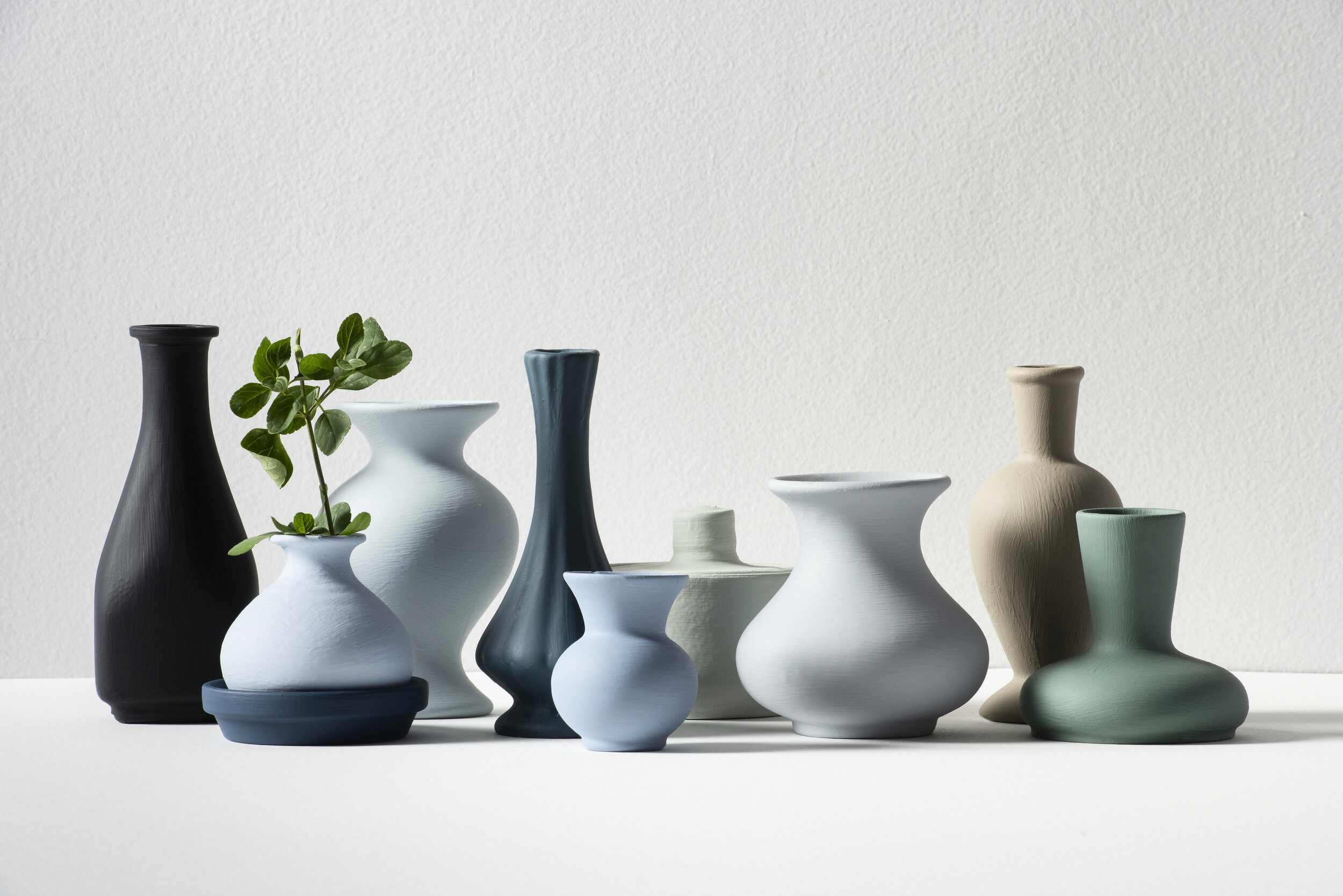
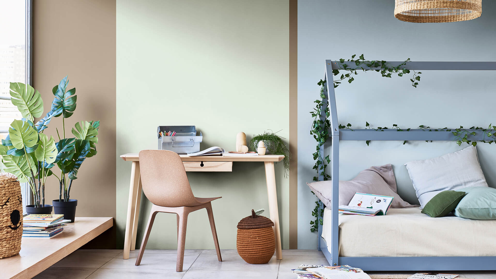
This one is all about echoing the tones of the sea, the sky and the soil. The all important connection to the natural world. 2020 might have been the only year where a walk in the park or the privilege of a garden was the most important part of our day so bringing these outside shades into our homes will help bridge the connection and make us feel more grounded.
Expressive.
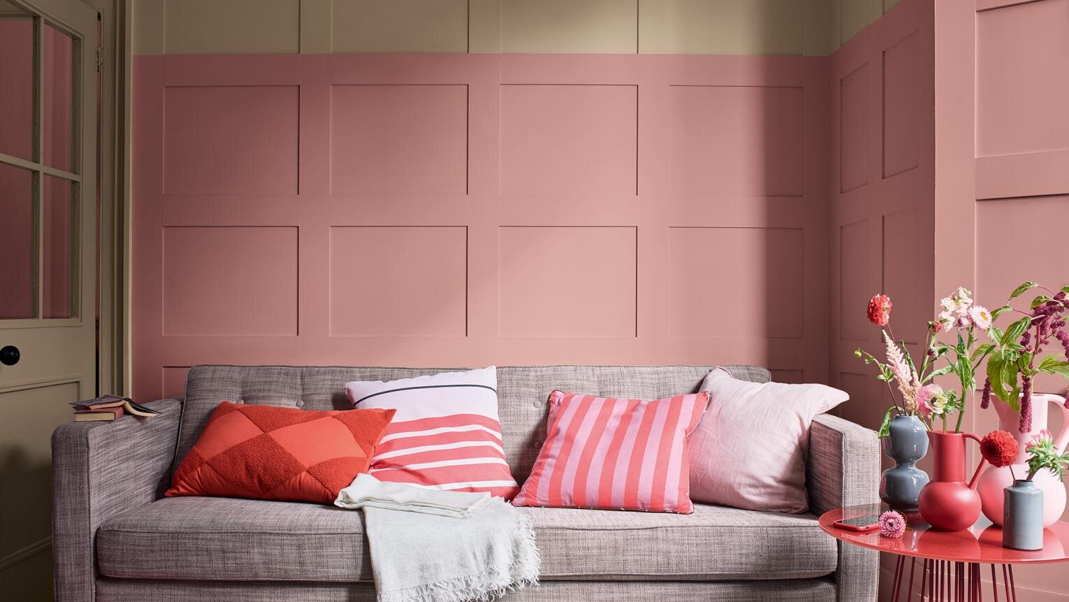
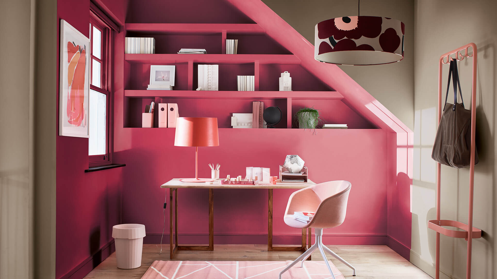
And finally the wild child. Expressive. Proving that Brave Ground is the most versatile colour, working hard across the spectrum and giving something to everyone. It means you can still instil your personality in your home and be as individual as you like.
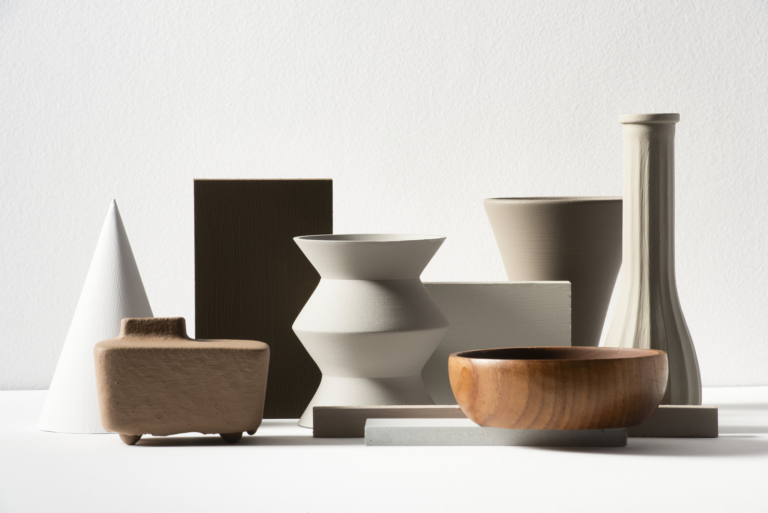
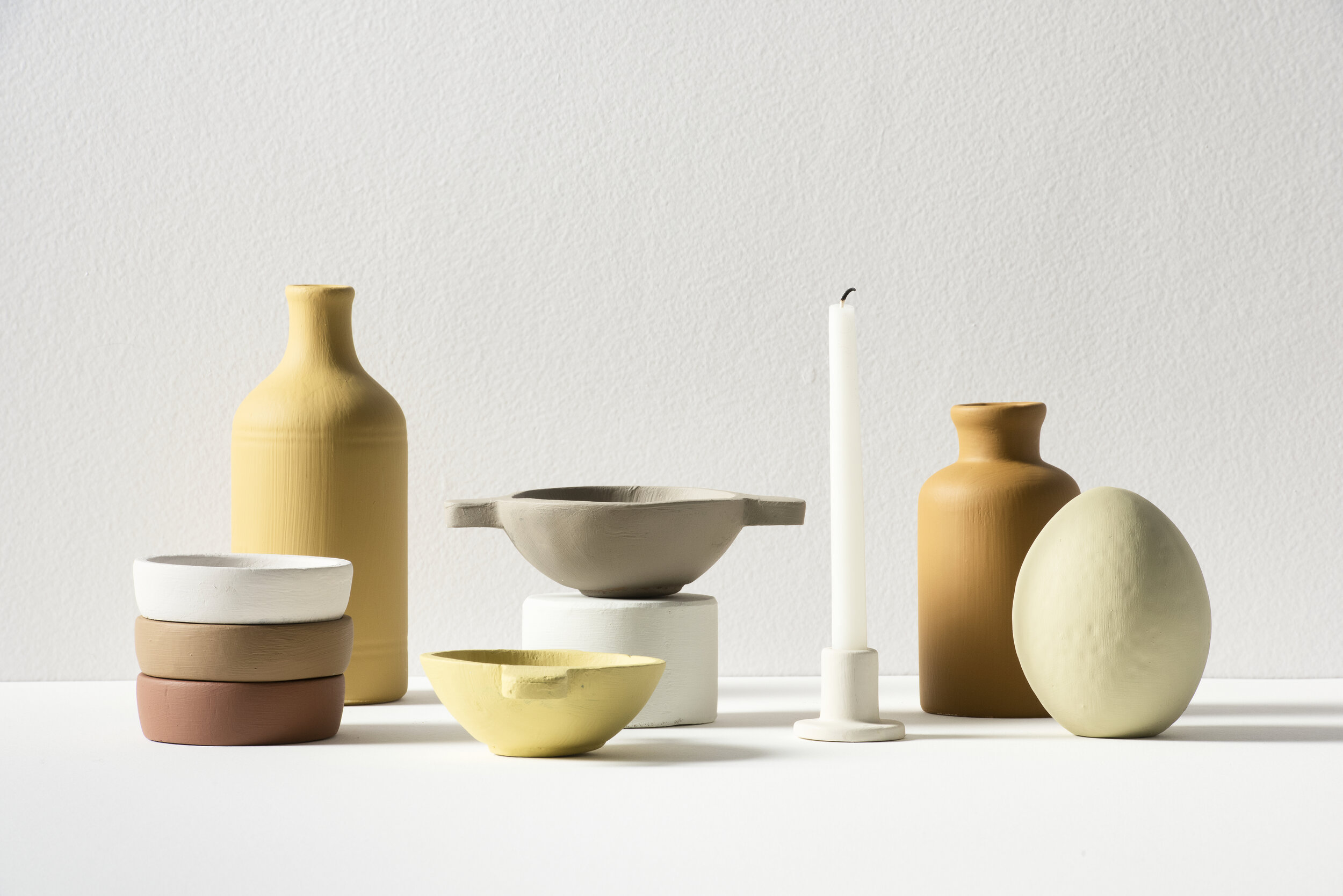
So what do you think? Whilst I might not be using Brave Ground on all four walls of my room, I can definitely see it working as an accent colour. Gorgeous linen bedding perhaps, or stoneware bowls and vases? I would love to know your thoughts on this years Colour of The Year in the comments below - will you be trying it out in your home?
